News and Articles
Read about upcoming exhibitions and see art demonstrations and art tutorials from Dupont Art Club.
Creating Art through Collage

Caroline talked about creating a piece of art through assembling items with collage. She showed that you can use glue such as the basic PVA glue plastic tape or even clay to cover the basic shape. she also uses a thick card to make shapes as well as using bowls or even a balloon to cover with a paper mâche. With the sample she was working with today she chose two pieces of collage papers that worked well together. With the first one, she cut it into an oval in the shape Would become a cat. She then cut out shapes of the ears and stuck these on with the other collage paper. She used a heavier plain heavier paper to work around the nose area. It was bent outwards, giving a cat like look. She then introduced paint. The paint went over the nose and eyes to start with, and then she added a mouth and tongue. If the face needed reshaping, she would add black around the outside of the head to do this. She then finished with painting the background to help the image pop out. She stated that you could use any papers for the collage as there are many ways of adding color and texture, including small stencils, which are inexpensive to buy as well as photos from magazines, which can add interest and be incorporated through painting onto them. The result was a fun looking animal, which we first wondered whether it was a mouse, but we decided that yes it was a cat and a cute one.
Monoprinting

Their various types of mono Printing. Using the gel plate is one or even going professional with a professional press is another. Caroline did a demo that was a very basic type of mono Printing. She started off with a plate of glass approximately 8 1/2 x 11 and a piece of watercolor paper that was double that size plus. She placed the glass on 1/2 of the paper and folded the paper over so that it was generously able to cover the glass. She taped the paper in place around the glass and made sure that the glass was not going to move. She started off the demo by starting a painting in a blue sky color with white clouds. This took up approximately 1/3 of the shape of the glass. She then folded it over the paper on the left-hand side over top of the painted glass so that the image transferred to the paper. She folded the paper back to its original positioned and continued on with the painting, stopping every 5 to 10 minutes and folding the paper over to capture the new image. She continued with this until the image on the left was similar to the one on the right, but different in its details as not all paint had transferred completely. This new image was something that you could not obtain through normal painting, but only through a transfer mono print.She stated that you could add further detail to the transferred image afterwards. The last image was of the piece of glass which she used to transfer the image to the paper.
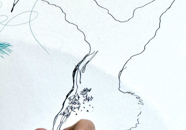
Drawing with Sticks

Caroline started her discussion on drawing with sticks by showing us her supply of various garden sticks. The one that she chose to use was a bamboo garden stick about 18 inches long that was broken off leaving a pointed end. She held this at it’s end. She mentioned that you could use many types of sticks for other mark making as well. The stick that she had could do scratches, lines, dots, blotches, etc. She chose a tiger head to draw with the stick and stated that one should draw out the overall shape to start with and then use hatching to draw in the shadows. You can use a twig with frayed edges for this as well. This is also good for landscapes. She stated you should get to know your stick with the thin and fat bits and where the ink moves around with it. The ink used was Quink, which dries paler and just needs to be layered to darken. You can use water soluble ink, which can be washed out. You can also use water down acrylic paints. There is no reason why you couldn’t use anything else for mark making such as Seagull quills which she splits down the middle. Just go out and look for natural or man-made objects that give unusual marks and have fun.
Understanding Colour

Emily Jolly took the class today and discussed color, how to describe it and the different ways to produce it. She stated that if you have six basic colors you could mix all other colors from this. The six basic colors are cad red hue,(warm) permanent rose,(cool) ultramarine, blue(warm), Windsor blue green hue(cool), CAD, yellow mid(warm), lemon yellow(cool). She went on to say that colors come out of these tubes as a saturated color meaning a clear, clean color. When these colors are mixed with others, they become unsaturated. With painting, the saturated colors appear to be to the foreground and unsaturated are in the background generally. All colors have a cool or warm tone to them as noted above. Warm tones will have yellow added to them and cool tones will have blue added to them. When painting a neutral image, such as sand on the beach or a tree trunk, it can become much more interesting if a warm tone is laid next to a cool tone of the same color and blended on the edges. John Singer Sergeant painting of the oyster catchers was a good example of this. If you go into wikiart.org and look up John Singer, Sergeant, you can see this painting and practice using the warm and cool effects that he has used to learn to use warm and cool colors effectively in your art.
Different Pens for Line Drawing
Caroline started her discussion talking about different types of pens and how to approach line drawing with them. In discussing the pens we are referring to the different types of ink formulations that they use. Caroline talked more on fountain pens and dip pens but there are others such as ballpoint pens, gel pens, roller ball,felt pens, et cetera. Each of these can affect your technique. An example is that gel pens provide smooth vibrant lines, ballpoint pens offer more control and durability and dip pens can give a variety of widths of lines. In discussing the fountain pens, Caroline mentioned that her favourite fountain pen is a Scrivener. Like many fountain pens they can be filled from an ink bottle or they will take pre-filled cartridges. With both fountain pens and dip pens you can vary the line produced by pressing hard or soft. This is not the case with many of the felt tipped pens which are made with certain shapes and circumference of nib to give specific lines. Rotary pens are like this and are used for specific drawing needs. There are also refillable fine liner and brush pens such as the Lumos brand. Dip pens come with a variety of nibs, all shape and sizes. They have a reservoir attached that vary in size before needing to dip again. There are some that even have a sponge underneath where you could draw for 1 to 2 hours. Carol suggests that the best all-around ink to use for the fountain and dip pens would be Quink ink. You can also use water soluble inks but not India ink or specific calligraphy inks which can gum up the nib. Caroline recommends Tom‘s studio which is an environmentally sensitive studio of innovative and handcrafted tools and pens.(https.//www.tomesstudio.com) When drawing,...
Portrait Painting

Caroline Instructed us with layering effects while painting a Portrait. She stated that painting a portrait working dark to light and drawing out the face first was one of John Singer Sergeant techniques. She proceeded to mix the paints ahead of time. She doesn’t use Brown but uses hookers‘s green deep and yellow for a nice brown. She lightens colours with yellow to avoid chalkiness of white. She mixes three types of yellow, very light, light and medium yellow. To warm the colours she adds a red yellow and white mixture and adds a little green to this for a pinkish tone. She chose a Filbert brush which is great for portraits. it is great for feathering. She started with the darkest shade in the neck and works around the face with this dark shade. She noted that with the green background there will be a reflection in the layers. Now Lighter layers are put in. With the mouth she put red on first and then re-drew them with a red dark green mixture. She then painted in the mid tones and blended with the lightest tones. While doing this, you are re-drawing areas in the face. Study the face closely with the colour shifts in it. Check your lines and correct using a big brush to stop your fiddling. Balance lights with shadows. You can use a small flat brush for accuracy under the nose and nostrils. Continue to check the angles and build up layers and blend.
Using Colored Pencils

Caroline started the class teaching the use of colored pencils. She stated that cheap inexpensive pencils do not work well when using colored pencils for a full picture. The best pencils have a high pigment content. You need to use a thick cartridge paper with tooth which can take the rubbing in that occurs using pencils. She chooses the 4 to 5 pencils she will need for this project and has them handy in her hand so they are readily available. She starts with a light sketch of this pot. She is going to be going from light to dark with the pencils and started with a blue colour which fills out the dark tone areas Layering is what is needed with pencils. You can use the regular layering or cross hatching as well. When layering, please note that the last color you put on will be the one that will show. She mentioned again that in order to get a nice black tone she uses a dark blue red and green to give a warm black. In order to get a rich dark brown, you could add orange over the black. Doing pictures with pencils can give you very sharp edges and photo realism. Remember to keep your pencils sharpened. In order to get softened edges, she blends them lightly. Once finished with the drawing, she uses a burnisher at the end to push the color into the thick paper. This gives it a soft, shiny look. One of the class members asked about water, soluble pencils. She explained that if you look at the stem of the pencil, the water soluble ones have a small brush on the stem which indicates that it is water soluble. You can use them with this technique dry and not add water...
Glazing

Caroline‘s lecture today was on glazing. Glazing is the layering of transparent mediums in order to affect change in the color of the original piece. It was used during the renaissance, especially using sepia in up to 40 thin layers. Impressionist did not glaze. Carolyn stated that acrylic glazing mediums are used along with other acrylic mediums. In her demo, she used water as she did not have the glazing medium close at hand. She started with the drawing of three fruits with a dark background, using yellow, red, black and white paints effecting a disappearing edge and reflected light. She used a watered down red color letting it dry in between layers. It gave an optical effect tinting a subtle change in the black colour. Watered down yellow was added. She warned that white paint added would give a chalky effect but can be used to lighten. Adding the layers of glaze gives the picture luminosity. The more layers you put on the smoother it becomes showing no brush marks and giving a lovely depth of field. She stated that glazing was excellent for using in portraits with the skin color. She used combinations of yellow and orange with a mixture of black and blue for the shadow areas.
Using Water Based Oils

Water-based oils are a relatively recent development. In the past oils were made with and cleaned with turpentine and regular oils. Some artists had difficulty with the fumes from the solvents and thus the innovation of water-based oils was welcomed. Caroline mentioned that there were three water-based oil brands that she uses, although this is not an extensive list. The Lucas Berlin was a suitable one, the Aqua Duo is expensive but very good, Cobra is suitable as well but she stated that the Artisans were inexpensive and lacked a lot of pigment so she did not recommend them. She went on to say that the big difference between the oils and acrylics other than the fact that they are made with oils verses plastics, is that the oils stay wet for much longer. Acrylics dry quickly and it’s difficult to get the same texture that you get with the oils. The oil pigments cover your canvas much quicker with one to two layers whereas acrylics often take five or six layers in order to get the same effect. Acrylics have a much larger range of colour choice than the water-based oils but you need a wet pallet to keep the paint from drying out. With oils she uses a pallet to mix the colours on the side prior and makes them into large colour blobs matching the piece she is working on. The first thin layer should dry within 30 minutes. She paints a bottom paint layer to her canvas to cover the white. She recommended if people wanted to try out the water-based oils, the basic colours she recommends would be the black and white along with ultramarine blue, Vermillion red, and yellow ochre. You could add the water based Linseed Oil (by Lucas) which can be used...
DUPONT ART EXHIBITION RESULTS

the 2025 Dupont Art exhibition was a resounding success. We exceeded the football from previous years and sold 12 paintings along with over 450 pounds sold at our shop People kept saying that it was so difficult to choose a winner as the level of expertise of our members was exemplary. In spite of this, there was a winner and it was Sandra Emery’s beautiful painting of two cats called Perfect Peace. Sandra received the People’s Choice trophy, champagne and wine along with free membership for the next year with Dupont Art Club.In second place with a lovely autumn painting called Autumn‘s Garden was by Judy Youssef. Judy left with two bottles of wine as well. Too well deserved recipients!
Painting with Pallet Knives

Painting with Pallet Knives. Painting with pallet knives can give an interesting textural effect to your painting.The knives come in different shapes and sizes. There are short square ones which tend to be good for using on roofs and shingles shapes as well as various flowers and grasses. The smaller diamond shaped ones have the springy tip and are good for sculpting in shapes such as rocks. These are also good for dabbing round flower type shapes in. The large larger pallet knives are good for dragging colors and laying down large sections of color. You can drag and wriggle the knife for reflections such as in water. The long knife shape is good for painting, edges, and cutting lines. It is also good to load your knife with the darker green blue color and pull down under the waves of water to accentuate the waves too good effect. Do not hold the pellet knife as if you were buttering a piece of bread. You should hold the pallet knife at a 45° angle with your fingers and the index finger on the actual knife itself in order to control the paint. Use a light touch. Do not press into the painting, but hold it flat against the page. Using the pallet knife will take up a lot of paint. If you were using heavy body acrylic paint, you will need to mix it first so it is not stiff before you start. Oils tend to be stiffer as well. Put on a fair amount of paint in order to obtain the nice texture that knife painting can give. Enjoy playing with these techniques, using the knives, both horizontally and vertically to see the different effects.
Quink used as a Water Colour

Caroline chose a large sheet of water colour paper and liberally applied water to the surface, the subject was a beautiful forest scene with reflections in a lake.With a mid sized pointed brush, for the background the Quink was diluted and as it hit the paper burst into the damp surface, some of the colour ran down the paper and Caroline picked areas to mottle and form the reflection in the lake area. As the paper dried, tree trunks were added, still with the diluted Quink.Once this was fairly dry a less diluted solution of the Quink was used to create nearer trees, however Caroline flicked water over the paper so some areas again burst into the water giving a beautiful soft effect in certain parts.Caroline used a rigger brush to add smaller twigs and branches gradually thinning as they went up the tree and into the distance. The background began to disappear and look very misty, all the time she gradually built up the reflections in the lake.To give that extra punch undiluted Quink was used to add the the nearer trees, a line added for the shadow of the lake giving a real 3D effect, every brush stoke was quick and loose, following the patterns of the leaves. Water was flicked, then Quink was flicked so areas burst out or stayed dark. It was important to allow some areas to remain white this allowed light through the trees and gave power to the dark Quink.
The Use of Brushes in Art

BRUSHES used in ART Caroline gave us an excellent education on various types of brushes used for art. She divided them into oil/acrylic/encaustic which use syththetic or hog brushes (encaustic) and the softer synthetic or synthetic/squirrel or Sable brushes for watercolour. Prior to starting she had a number of tips for us. Generally, watercolour brushes have a shorter shaft. The longer shaft in brushes are used with other mediums so you can stand back from your easel. The sizes listed on the various brushes differ from company to company so it is difficult to determine the brush by the size listed. With all water based brushes it is a good idea to pat them with a tissue so there is not so much water being taken up on the brush. There are various types of cleaning products for brushes. A very good one is called ‘The Masters Brush Cleaner and Preservative” which is available in small cans. She recommends that you should clean your brushes daily to stop them from developing dried pigment at the base. If the brush does become filled with dried pigment but still has some brush at the top that’s available try cutting into the brush and use it for mark making. With regard to the price of various brushes, she has found success with the cheap brushes that she uses vigorously and then discards. For a better quality she recommends sennelia , da Vinci and pro art for good quality. NEVER use your watercolour brushes for anything other than watercolour as it could destroy their effectiveness. Keep these brushes separate from all the others. BRUSHES: Flat brush: This brush is good for Mark making. It is good for angles and straight lines. Try putting two different coloured paints on each side of the bristles to...
Lost Edges in Painting

Lost Edges in Paintings Using photographs from paintings by John Singer Sargent, Caroline showed the edges which melded into surrounding background colours. These lost edges create moods of mystery and creating distances. It makes images meld into the surrounding area. The surrounding hard edges will pop out bringing your attention to them. In Carolines demo she shows how the red apple’s shadow melds into the dark background as do the grapes. The use of lost edges is a useful way of bringing out some areas and melding others into the background.
Mono Printing and Jelly Painting

Mono Printing and Jelly Painting Steph Howard gave us a demonstration on mono printing during our Thursday Dupont class. She used Essdee water soluble block printing ink but said that the Speedball printing ink was just as good. A piece of acetate was given to each person and instructed to put a small amount of the black print printing ink on it. This was rolled with a brayer roller for at least 5 to 10 minutes until there was a mat Sheen on it. A thin paper was placed over top of the acetate with ink And a quick line drawing was made with a pencil on the paper. We were told that the shadowing around the body could be made with the pencil or even with your finger. Once the paper was removed, the drawing was exposed. This process is almost like using carbon paper but with inks. Lucy demonstrated jelly Printing. “ Jelly arts gel printing plate looks and feels like gelatin, but it is durable, reusable and stores at room temperature. It is easy to clean and always ready for Printing. Printing on a jelly plate is Simple and fun” from jelly arts printing plate. Lucy printed acrylic paint onto the jelly pad with a Brayer roller. She then used numerous items to imprint on the acrylic paint such as plastic items, cardboard , bubble wrap, and even making her own with glue gun on a cardboard roll. Anything can be used as long as it is not sharp and does not cut into the top of the jelly pad. She then put paper over the imprint and lifted the paper to show the drawing. She used a feather on one of the demonstrations and leaves can be used as well. She suggested to check the transparency...
Using Watercolour Pencils

Caroline demonstrated how to use and get the most out of watercolour pencils. She picked quite a colourful portrait of an older lady. Looking carefully she decided which colour pencils were needed for the face, red being a strong colour and yellow a weaker one. Starting with the dark areas, she began to 'layer' the colours red green and yellow ochre. When the water was added the colours blended together. She said to avoid using white as the luminosity would disappear. it could give a chalky look For the nose, a pale yellow with a peach on top was used. The highlights as with all watercolour are the white paper areas which are kept clean to give the brightness. Purple and browns were added to the really dark areas trying to get as much pigment on as possible. Hatching or crisscrossing will disappear once water is brushed on. Warm reds over the purple helps to build up the picture. She put pinks over brown. The cheeks were built up with yellow, orange and red. The Lips were red with purple darker areas. These needed plenty of pigment as they are the focal point. She put lighter red for the bottom lip. The glasses should be thought of as part of the face with the eyes within them. Carefully look for the white areas of the eyes and add the pupil. She painted green around the eye then added red to warm it up. Brown, yellow and black was used to really emphasise the eye. Keep checking the tonal values. The hair was brown and dark purple with added brown to the shadows. It's a good idea to squint so you can really see which areas need more tonal value. Make sure everywhere is dark as you want before adding water....
How Watercolour Behaves Painting Flowers

Caroline started off this demonstration by instructing us to soak our watercolour paper for 5 to 10 minutes. She also stated that she used a size 12 watercolour brush and a rigger. She recommended 300 g watercolour paper taped down in order to stop the wrinkling of the paper. You could use it at an angle to encourage drips or flat. She started painting very pale red in the form of flowers. With the wetness of the Paper it gave it a soft result. Once this was completed, she added a purple to the red and then added this warmer colour to the inside of the flowers. She also added water underneath the flower to encourage dripping and spreading. She then worked with yellow ochar for the tops of the flowers. The paper was dry at the top so she was able to get harder edges. She mixed her Emerald green with yellow to give a light green which she painted in the stems. She added a bit of red to darken it and continued varying the greens. she added drips to the greens as well. She stated that if you wanted to take out some of the colour you could do so by blotting. You can use masking fluid initially if you wish or to add gouache which is non-transparent. She said no to the use of the watercolour eraser as it takes the top coat off the paper and reduces the luminosity. She then went over the dried flowers with quinacrine pink and a alizare crimson to draw in the flower shapes and bring the dark forward. For the centre she will not use black but combines green red and ultra marine blue for a soft black which she painted in the centre bits of the flowers. Someone...
The Language of Shadows and How they Behave.

Caroline Marsland instructed us that perspective, shape, tonal values and contrast are what we need to look at in mastering how to draw or paint in the shadows.There are dark shadows blending into half shadows as well as reflected light. Often light will come up from the bottom.With some shapes such as a tree, the shadows will undulate. Shadows can describe shape such as with steps as well as in a portrait. with some shapes such as a tree, the shadows will undulate .You should squint to look at the shadows of what you are about to draw. You must know where the shadows fall near the light and be careful of the half shadow area. She has used a 6B pencil to draw in the figure with in half shadows using hatching with darker shadows added.You continue to darken the shadows with an 8B pencil. You continue to darken the shadows with a 8B pencil which will not give you a sharp line as it is too soft. The shadow can change the shape of your picture. You must be careful with the half shadow as it reaches the light. When painting Caroline suggested that you do a light wash over the area first before you start to decide where the shadows and half shadows are. Dark areas are a focal point and lead people around the painting.Landscapes are best with darker shadows generally. She encourages us to do a rough sketch 1st to outline where your shadows are going to be.
Drawing With Inks

Caroline was unavailable to demonstrate for us this week, but fortunately Amanda Davies came along to show us how to draw with ‘drawing’ ink as opposed to writing ink, the latter used more for calligraphy. It’s was am extremely informative demonstration.Pens, different drawing pens for drawing ink, these have a split in the nib and are pointed as opposed to calligraphy pens.Paper, any paper can be used, even a brown paper bag but the smoother the paper the the further the ink will flow and glide over the surface, Amanda likened to dancing with the pen. If you are planning on using water colour paints a heavier paper is needed, however the ink is permanent when dry, (ink line and wash) so other mediums can be used and water colour pencils work well. Amanda has also used coffee dregs to draw with, to add more interest.Note, always check on a sample page how the ink is going to react on your paper of choice, see how far it flows and thickness of line.Drawing the Portobello Mushroom,Colour inks - Burnt Sienna, Nut brown,Black and Peat brown.Using water colour paper, a pencil can be used if your nor feeling confident, however Amanda drew with her pen, she dipped the pen in the burnt sienna ink making sure the well was filled, tested on similar paper to see what line was going to be made, and drew the mushroom outline, try to relax an following the shape.Always wipe the nib after each use to keep it clean and ensure a true colour.With a pipette Amanda used one of the ink lids to mix her inks and a brush to add a wash of colour to the mushroom. The ink dries much quicker than water colour, but can be blotted to lighten if needed....
Drawing upside Down

Caroline said nothing is too difficult to draw! If you look at the picture upside down.By turning the picture you make your brain think in a different way. To start look for shapes, major shapes, in Caroline’s picture this was the rectangle in the middle, easiest point. Check if the vertical or horizontal lines are correct by using your pencil as a reference, you can also use the pencil to measure length and depth of each ‘shape’.It’s important that each shape is relatively to the next, use your pencil again to check which shapes in different parts of the picture line up with you starting rectangle, this will help with perspective.Once all the major shapes are positioned, add the smaller detail ‘shapes’ how they overlap each other, some will just be lines. It’s like building a jigsaw puzzle.Next is the tones, larger areas could be lines or hatching, make sure the tonal values are darker for the shadows around objects, light and dark areas.Nothing is too difficult to draw if you break it down into simple shapes concentrating how they line up with the other shapes and of course measuring the lines. Keep checking the position of each shape with all the areas of the picture this will help to get the picture positioned on the paper correctly.
Line and Wash

Caroline picked a lovely picture of an Owl she wanted to create a loose and expressive picture. Using water colours and remembering not to keep painting over the same spot, which would mean the luminosity would be lost as the paper surface could be spoiled, two yellow ochre eyes were painted, then a wash of emerald greens raw siennas, the grey plumage was created with dark red and blue with a touch of yellow ochre, softly painting the shapes of the feathers, all wet into wet all very loose, drop the paint in. The wash is just the support for the pen. Flashes of orange and green sweeping with the water colour brush, dulling down with sienna if too bright, look for and try to keep the different tonal values. Similar colours for the background but more watery. As the eyes are the vocal point Caroline added green to give depth. With a bic biro Caroline started to build up details of the feathers, to add texture and more interest hatching or scribbling or circles could be worked, like an etching, slowly building up values, keep going darker, echo the shapes of the markings, remember to keep certain areas lighter. As water colour dries quite a lot lighter, go over prominent parts again so they show up, keep you eye on the tonal values all the time. Wet the area then drop in the colour again darkening the feathers orange and blue for brown feathers. The eyes are the important area lots of work with the biro to bring out the owls character, to bring back light white gouache could be applied with a rigger brush or a cocktail stick. Add shadows to the head
Wet into Wet Watercolour

The demo today Caroline chose a winter photo of a small brook and trees in quite dull mono tones. She mixed a yellow quite watery and washed over the sky, she then mixed some purple with the yellow and blended the paint onto the paper, carefully leaving an eye catching, White centre to emphasise the light.Caroline then added an orange to the purple to cool the colour. She did a soft background of impression trees, banks at the side of the brook leaving lots of white gaps to give the look of snow and add light interest. Still keeping to the purple and orange mix but creating a darker colour she pulled the paint through the damp background, making the paint bleed into the background, to form the trees, using a rigger and a larger brush, to soften the edge and give tone she brushed away the edge of the trunk and branches. She also had a small twig and scratched into the fresh paint to give a lovely texture. At this point the paper was not too wet or too dry, salt was added to give even more texture. One the trees had dried slightly darker tones can be added but still keeping the softness, dropping in darker tones on top so it bleeds in gives a misty effect. Caroline added a touch of red to the centre light to draw the eye. For the bank in front, again a wet mix of purple/ orange/ red dropped in, flicked with the brush, allowing the paint to melt together, and more salt once it has dried slightly. Going back to the trees, Caroline pulled darker colour through adding to the tones, again using a dry brush to soften the edges. Keep looking at the picture make sure the light is kept and the dark tonal values emphasised....
Watercolour Negative Painting

Watercolour Negative Painting Caroline explained that we will be creating the positive by painting the negative. She started by painting areas of colours yellows, reds, oranges, and browns with a large brush.She added salt on top of the wet parts and placed cling film over part of it. She sprayed the remaing part. Using dark greens and browns with she parted to paint around the edge of the leaf letting the background colour show through in places.She added a second layer to the dried areas to darken them adding salt to them. She glazed orange over the leaf flicking dark paint over top. Using a ringer brush she demonstrated how to flatten it out by pulling it over one side then the other. Once flatten she used it to draw in further lines into the veins of the leaves. She suggested not to draw around the total leaf as it will flatten the look of it Final piece first paint negative painting
Critique of a Painting

How to critique a painting. Caroline explained that in looking at any picture one should follow the line, colour, tonal value, contrast and how the eye is guided through the picture. The focal point is a very important area of interest. It is where you’re going to put the most contrast in value. Caroline has selected a photograph of a painting for us to study located below.. The first area of interest we find is the body of the lady who is in white against a dark background. In looking at her, we follow her eye, which is looking upwards to another figure who is in white but not as large and is looking down at her. This takes the eye back-and-forth and from the man, The lines go down the tree and across the bottom area so that you are actually circling the photo with your eyes. Brush marks can also give direction Along with the line, colour, total value and contrast. Carolyn stated that Brown is a neutral color along with gray. Opposites on the colour wheel in a painting help the images to pop out. The pink in this photo makes you hunt for other pink areas as well. Texture makes things pop out. In looking at warm versus cold colours, the warm colour advances and cool colours recede. Moods can be established through dark mystery shadows. Light colours tend to be more upbeat and happy. Caroline explained that during the process of painting we can take out and put in objects, colour, line, etc., throughout the whole process until the picture is finished. Even if you have painted the most gorgeous image and are hesitant to do anything with it, if it doesn’t fit then just paint over it or change it into something else that...
Sorry, we couldn't find any posts. Please try a different search.