News and Articles
Read about upcoming exhibitions and see art demonstrations and art tutorials from Dupont Art Club.
Painting like Wayne Thiebaud

Wayne Theibaud was an American painter known for his colorful works depicting common place objects, such as pies, cakes, lipsticks, paint, cans, and ice cream, cones, etc. He was born in 1920 and died in December 2021. he used heavy pigment and exaggerated colors for his subjects with well defined shadows. The objects were simplified. Caroline used his cheesecake photo to illustrate this artist big brush approach. She drew the shape in greens, including the blue for shadow and under the plate and then used the following colors to paint the cheesecake . CAD red mid and light, primary blue, phalo green, and white. She recommended using inexpensive paint to try this out as you layer the paint on quite thickly like icing. Towards the end she layered over the painting swiftly with big dollops of paint being swished around, especially on the berries. Enjoy playing with this artists way of painting.
Drawing Complex Building Scenes

Drawing Complex Building Scenes Break the building scene into shapes of small, medium and large and start with the large shape. Finding the middle of the photo draw in the large shape of the dome. Do not add the detail yet. Switch over to the horizontal lines connecting the dome to the remainder of the shapes. Find the vanishing point. There may be more than one. There may be more large buildings so before starting with the smaller ones add these. You can then go to the medium and smaller shapes and draw what you see is there not what you actually think is there. Start with the detail and tonal values by adding shadows to complete the shapes. This is almost like doodling in these areas. With the small shapes just draw in the tones of the shapes. Be careful not to draw dark shapes near the edge as it could take your eye off the page. If the shapes need adjustment at this time you can draw these in. For drawing distant buildings, Caroline suggest drawing a varied line for the horizon as she has indicated in the photos below.
Portrait in Charcoal and white Pastel

Portrait Drawing in Charcoal and Pastel White This exercise by Caroline is on tonal values. She started with a light grey drawing of the face. The charcoal was then used to draw the darker shadow on one side of the face. Charcoal is easy to wipe out, erase or smudge if a mistake is made. To help with the drawing measurements, she draws points, on the drawing on the width of the nose and mouth and eyes. The width of the nose is often the same as the width of the eyes. With the eyes check out the area of white in the actual eye. The ear starts above the level of the eyebrow. Measure all of the distances according to the facial distances. She starts with charcoal and blends. She can use the white but not for blending at this time. She then repeats the charcoal to darken over the shadows. Once they are drawn in the white pastel can be added but not blended as it simply turns grey with the charcoal. It is OK to blend it at the end if need be. At the end of the shaping of the eyes, they can be redrawn with the white pastel and the iris can be corrected. You were constantly adjusting. The charcoal that she used was by Coats, but she was not happy with it as it was quite scratchy. She suggested that the Windsor Newton charcoal are very good, as our a number of other charcoals. Enjoy practicing with these mediums and portraits.
Collage with Acrylic Paint

Caroline sketched out the head of a tiger, then using non shiny magazine pictures she picked out different coloured paper, some with interesting patterns, you could also use old postage stamps, wrapping paper, anything that will create interest and draw the eye. With a strong Pva glue you could also use old jewellery or even pebbles.Covering the tigers head with Pva glue, Caroline tore and added strips to the face, picking out a colour and shape for the nose adding extra layers again to create interest through texture. A jigsaw effect. To draw everything together, acrylic paint will cover most surfaces.Caroline mixed white yellow and red for stripes. She added a little yellow to white for the white stripes, blue, red and a little yellow and pink for grey using an old bristle brush to create the look of the fur. Then giving detail with black. The focal point are the eyes for which orange with a hint of black just to dull it down, circled with black and then the tigers markings, the nose was yellow with a hint of orange. The paint pulls the picture together and can make for a subtle look. Glaze everything when dry
Mark Making and Tonal Values

Tone, texture, colour and line! Caroline had quite a boring picture of brown cliffs going into a distance. With the use of acrylic paintsShe mapped out a rough line of the picture, then starting with the nearest, the foreground, she used warm colours to bring the cliff forward, yellow, red and blue to make a warm brown. She mixed the cooler colours for the distance, primary blue, phthalo green and red to dull things down, making a kind of turquoise.With lots of underpainting and thick brush strokes the first cliff started to appear from the paper, lots of reflective light into the sea and the sea colour, to the lower part of the cliff face building up lots of texture, adding rocks in the sea, the top of the cliff in contrast was light to give line and impact. As she continued down the line of the cliffs, duller colours and less texture to give them distance, adding dark shadows to separate the different sections.The movement of the sea imitated by the movement of the brush, tapping in different textures and blending whilst wet. Remember to cool colour down with a red in necessary.A wild sky was added with all the colours of the cliffs and the sea, giving a very moody storm look.To get different textures use old bristle brushes adding red or blue to give the tonal values, foreground or distance.Play with the paints adding purples to bring out the rocks and cliff edges to separate them.To give the white water movement, add a touch of lemon to the white, tap the white over the rocks and the bottom of the cliff and scratch for more texture and movement. Add light and dark to the top of the cliffs to give light using different angle brush strokes, going...
Abstract Ben Nicholson style

Caroline had a still life picture of a fruit bowl, Nicholson would pick out and separate the main shapes. Caroline drew the out line in Sepia ink with a small brush giving harder lines to give interest. She started by ‘seeing’ a star shape in the centre of the orange, she overlapped the grapes to give a better composition, she then added the bananas and apple. Nicholson liked warm colours to the foreground and cold to the background, he loved to add texture and flicked paint to add more interest. Using ultra marine, yellow ochre, adding a red to make various shades of grey. Adding a blue centre star to the orange draws the eye, then adding yellow on top of the orange paint. Lovely yellow bananas outlined with green, turquoise grapes carefully leaving a dash of white to give shine, muted apple, red and green yellow for light. Caroline carried the orange carefully through the the background, but used the muted greys to outline making sure there were no hard lines.
Expressive Loose Watercolour Animals

Caroline sketched an outline of squirrel. She mixed the water colours ready for use ranging from raw sienna, ultra marine, red, yellow ochre, green pthalo, and mixed to form lights and darks of purples and grey.She squinted to emphasise the dark areas, and noting any specific interest. Caroline started with the head. A twig or a drawing pen can be used.Using dark colours then pulling down with the brush to move the paint to a lighter tone, she blended the areas together, made sure the light around the eye was kept and the dark above emphasised. Keep the brush light using water to give a light wash, wiggling the colours together, flick and scratch to give looseness and texture. Because the colours are mixed in the beginning you can granulate the paint down the squirrel so the colours bleed into each other giving a soft but striking work. Water colour dries lighter so to keep the tonal values it will be necessary to go over the dark areas again. The tail was a wash then colour dropped in, Caroline made the black with red blue and green, keep working whilst wet, splatter and scrape again for texture. When the head was dry, Caroline filled in the eye leaving a slight white slit. She did use some true black for this. She emphasised the eye socket. Be bold with the dark but keep the light areas light. Go back to the tail repeat the dark areas but blend with water. She used a hint of red which she then added to the eye area as a reflection, splatter, scratch and flick. Any background needs to be muted as it would spoil the impact of the colours in the squirrel.
Painting watercolor skys and Clouds

Caroline instructed us to have all of our colors mixed ahead of time. She used yellow ocher and ultramarine to make the grays. All primaries mixed together will also make a gray. She used the turquoise straight without mixing it. For method one she took a large brush and painted a wash across the sky. She let it absorb until it was slightly damp. She picked up the shape of the clouds with a sponge and the bottom line of the cloud was, painted in a light gray. The shadows around the cloud were also in light grays. To get rid of the hard edge, she put a wet brush along the bottom to help move the line. Method 2 This method has no wet wash. All she did was paint the sky color around a cloud shape and used a wet brush to merge the hard edges into the clouds with a light gray. She painted lines into the cloud this way. Message three. A rainy sky was painted by using yellow ultramarine and red. She started with a pale yellow at the top of the cloud and orange at the bottom, and then used gray with the sharp edges, washing into the top of the cloud, into the yellow and into the orange. Some purple can be added to this as well to suggest rain. She suggested to keep this wet all the time to blend. Caroline uses the white night watercolors as they have very high pigment and are reasonably priced. In case any of us use these watercolors she informed us that apparently the white night watercolors which are from Russia are being taken off the shelves as the UK added a 30% tax on them so the manufacturer is withdrawing them from the UK market....
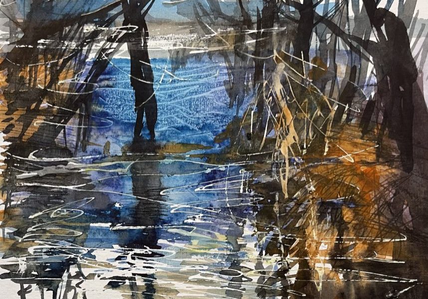
Ripples and Reflections with Coloured Pencils

Caroline often starts in the middle of the picture and works out. The dark/light contrast attracted her so that was where she started drawing the buildings, measuring shapes in comparison with others. She drew with a 4B pencil but normally would choose a 7B. She hold the pencil from the end( the back) to get more movement. The shadows were drawn in blacks and grays in cross hatching to darken. Caroline said that the best pencils were polychrome and Albert Durer. The cheaper ones had lighter pigment. She recommended putting on the colour in a similar way to when using pastels. One can purchase the blender and burnished pencils to assist. With the colours, she blended colour to achieve the correct tone. With the yellow, she swirls green lightly over top to blend. Her black was not deep enough so she added dark green and red blending in. Also red and blue were used in another area. One can see hints of colour underneath. It is imprtant to make the marks in the direction of the ripples using swirls for the bushes. You can only add so much colour before the area is saturated. photos
Expressive Trees in. Watercolour
This workshop with Caroline started with the painting of white masking fluid over white areas and reflections.After letting it dry, she mixed pools of turquoise,purple, blue and orange. Painting the purple loosely she covered it with plastic wrap and left to dry. She removed this leaving a lovely texture. She added orange with deep brown for the trunk of the tree scratching into it. She added splatter and painting in the reflections scratching this side ways. She went on to paint the bushes and trees with the strong colours coming forward blending them into the water. She bent the reflections as they enter the water. Once it dried she removed the masking fluid and added small twigs and detail with a small brush.
Dupont Portrait Workshop

Caroline lead a workshop with sixteen eager members on how to draw a portrait from a live model. She started the afternoon with the basics on portrait drawing and left us to use what ever media we chose to do a head or full body painting/sketch. It was lots of fun with much hilarity over some of the results. Caroline was pleased with the results and we will be doing this again in the near future.
Oil Pastels with Flowers

Caroline started off the demo showing us the two types of oil pastels that she was using. The first was Fabrer Castell which she used to draw in the shape of the flower in white pastel on a black background. These pastels are cheaper to buy and don’t fill in the colour effectively.. The second was Sennelier. These oil pastels are very soft and buttery with high pigment which covers the surface very well.. She often uses SeaWhite brown papers for her pastels. After drawing the shape of the flower she filled in from the outside towards the center with white showing texture. Pink and red were added. She used her fingers to blend.adding yellow at the base.She uses pale blue as shadows.She used cool and warm greens veridian and emerald, in the background. She finishes with details drawn in using dark browns and reds. As oil pastels never dry completely, they need to be framed behind glass.
Still life Drawing, shapes, colour , tone.
The still life painting started out with mapping out the shape. A line was drawn down the middle of the page after which the shape of the jug was drawen. Shadows and reflections were then painted in black with mixes of blue.Big brushes were used to add layers of shadow colors.Once the correct shape and position of the still life has been finalised, 3 shades of the main colour we’re mixed ready for the shadows and lights to be defined In light, medium and dark.remember red helps to dull colour down. An optical hit was given using another colour from a reflection. Orange works well with the. Blue. It is good to squint as it helps pick out the light and dark Which need highlighting to bring out a 3D effect. Reflections in shadows helps place the object and add interest. It is good to blend the colours while the paint is wet on the canvas. Keep squinting adding dashes of white with a rigger brush and slightly blending the paint. The ‘shine’ will draw the eye to the key areas you want to emphasise. Don’t forget the back drop, reflections, shine as it all adds to the 3D effect, Keep looking ,sitting back and checking to make sure you pick out the key light and dark areas. finished painting of the jug.
Painting Spring Flowers in Acrylic on a Black Surface

PAINTING SPRING FLOWERS IN ACRYLIC ON A BLACK SURFACE Lucy Parker demonstrated a dramatic version of a seasonal still life on good quality black paper. Many people were tempted to give it a try themselves during that afternoon, where Lucy was available to assist. She started by using quality acrylic paint with good pigment to ensure better coverage, otherwise there's a possibility that two coats will be needed. A brush loaded with paint and relatively little water is needed. Some transparent colours like yellows benefit from a white undercoat to ensure the black substrate does not show through. Lucy demonstrated a loose and expressive approach, not aiming for botanical accuracy, by building up a quick and sketchy base layer. She started painting the flowers from the base of the stems, moving quickly towards the head like a firework. Then the leaves were added to create a pleasing composition before working on painting the flower heads. When this layer dried she went back in to refine and add some details. During the demo we picked up many useful tips. Lucy reminded the audience of the benefits of a stay-wet palette to keep acrylic paint moist and workable longer. She shared tips on how to make one with a shallow tray containing damp kitchen paper and a layer of baking paper or tracing paper. Tips on mixing realistic shades of green, which were essential for this subject. And other useful colour mixing tips. Also colour loading with two different colours on the brush - so effective for the different colours in the tulips. Painting water with the elipse of the water line and the distortion of objects seen through water and clear glass.
Painting Spring Flowers In Acrylic on a Black Surface

PAINTING SPRING FLOWERS IN ACRYLIC ON A BLACK SURFACE Lucy Parker demonstrated a dramatic version of a seasonal still life on good quality black paper. Many people were tempted to give it a try themselves during that afternoon, where Lucy was available to assist. She started by using quality acrylic paint with good pigment to ensure better coverage, otherwise there's a possibility that two coats will be needed. A brush loaded with paint and relatively little water is needed. Some transparent colours like yellows benefit from a white undercoat to ensure the black substrate does not show through. Lucy demonstrated a loose and expressive approach, not aiming for botanical accuracy, by building up a quick and sketchy base layer. She started painting the flowers from the base of the stems, moving quickly towards the head like a firework. Then the leaves were added to create a pleasing composition before working on painting the flower heads. When this layer dried she went back in to refine and add some details. During the demo we picked up many useful tips. Lucy reminded the audience of the benefits of a stay-wet palette to keep acrylic paint moist and workable longer. She shared tips on how to make one with a shallow tray containing damp kitchen paper and a layer of baking paper or tracing paper. Tips on mixing realistic shades of green, which were essential for this subject. And other useful colour mixing tips. Also colour loading with two different colours on the brush - so effective for the different colours in the tulips. Painting water with the elipse of the water line and the distortion of objects seen through water and clear glass.
Nest and Eggs in Pastels

Birds nest and eggs Medium Chalk pastels on black paper. Work from dark to light, starting with a brown to outline the nest and position the eggs so they will form the focal point. Start building the nest with the dark browns introducing lighter colours and blending them, this can be done with the pastel stick or your finger. Make sure you decide on the direction of the light and add the lighter yellows and orange. It’s helpful to keep the colours you are using grouped together so you can keep going back adding and blending. Add the green leaves blending a little green reflections into the nest. Look for shapes of green and pick out details with yellow blending again. Use white to highlight the background creating a 3D effect. Build up the layers and gradually add the lighter, whites and yellows to add the details. Using black to define the shapes of the twigs. For the eggs, work dark to light again deciding where the light will fall. Dark blue blending in light blue, white for the light, all blended. Use black to define the shape of the eggs and add black in amongst the browns to give depth and contrast. Finally add the dark marks on the eggs following the shape, but not over working.
Planning a Painting

Caroline used a photo of 3 puppies, but the ideas were to be used on location so you can capture the tones and light of the moment. First she planned the construction of the painting using artistic licence to alter the height of one of the puppies to help the definition and balance, this also helped with blending the tones. Consider the background, different coloured backgrounds can enhance the colours of the paint and also can be used to reflect in the subject of the painting. Green can bring out reds. Caroline started with an eye as the focal point then built up the light colours, orange and yellow, moving to dark area and blending the colours to give many different tones. Then using dark red and dark green to create the browns, remember the light areas on the nose and which way the light is falling, add in the shadows, make notes, enough information to paint the subject in a weeks time by just referring to these plans which could help with creating a more natural finish.
Painting a Short Haired Black Dog

Caroline did a rough sketch in acrylic paint of the Labrador, then mixed colours rather than using black. She looked for colours which were picked up in the sheen from the surroundings, green and red to give it depth. Make it stand out rather than a boring photo. Blocked in all the dark areas first, mix of blue, yellow, red, then the mid shades and finally the details of the lighter colours which you can over lay with acrylic. The older and bristlier and uneven the brush the better, follow lines of the fur, lots of flicking strokes. Paint needs to be quite fluid so quite a bit of water. Details afterwards with a rigger brush and she did use true black to outline the nose, and only a little yellow in the white.
Pointalism in Watercolour

Pointillism describes a technique in which hundreds of small dots or dashes of pure colour are applied to the canvas in order to create maximum luminosity. Colour spots are blended into a range of tones. The dots of colour give a richer and more subtle effect then can be achieved by conventional techniques. George Seuart and Paul Signac were well known for using this technique. Check your colour wheel as using complimentary colours can intensify your colours. Caroline used cotton buds to add the dots to her painting blending with them. Viewing from a certain distance the dots of colour blend into a richer and more subtle effect.
Moody Landscapes with Acrylic
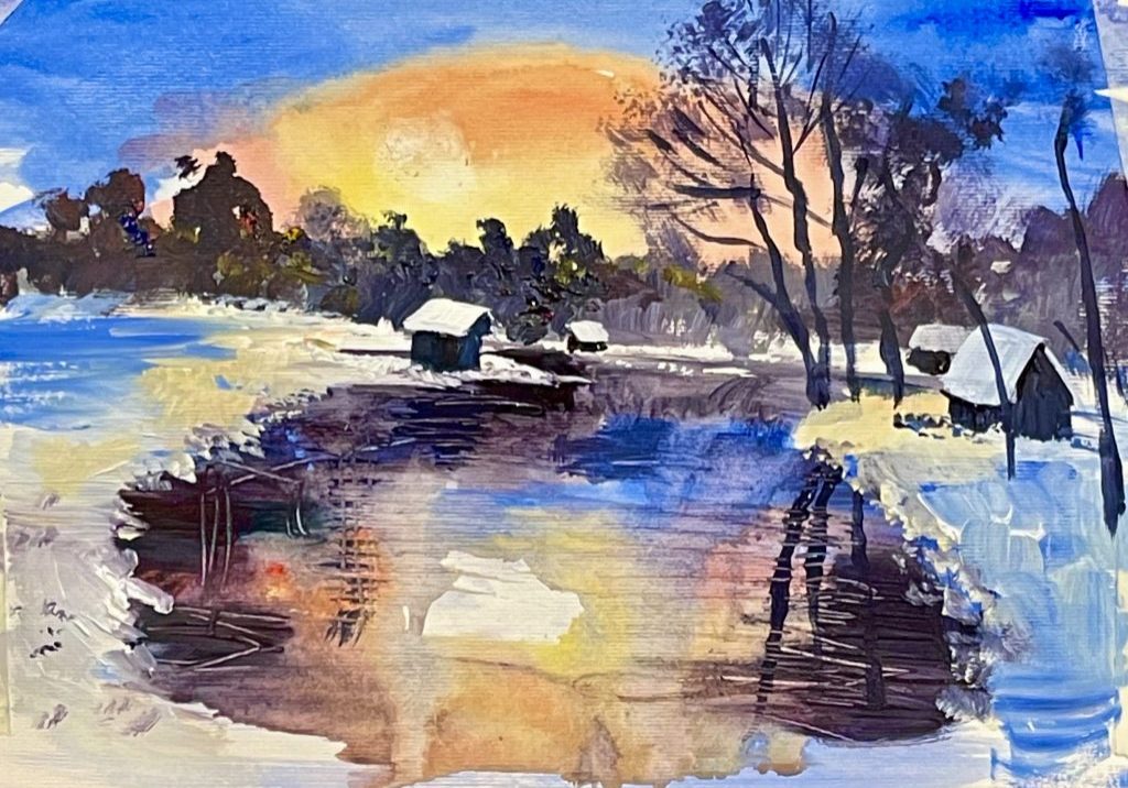
Caroline Marsland, Dupont instructor, started this painting using a fluid wash of acrylic with watercolour techniques, . Using these light washes gives luminosity to the sky which is painted with cobalt blue. You don’t get this affect with thick paint. Caroline added a yellow red mix with the blue on top for the sky, blending the colours. She then added the trees in pale grey over the luminous sky and darken the gray of the trees on the second layer trees to bring them forward. She dabbed down on her brush to add foliage. These sky reflections were painted in the pool and surrounding areas. She uses water to drip and blend these reflections. The snow was painted in white with a yellow and orange tinge in the water plus white with blue in other snowy areas, She tapped around the waters edge to give the snow texture. Trees were put in with a rigger, dragging the trunks shapes up, and the tops are added with tapping a brush to indicate foliage again. The small buildings are painted in with their snowy white roofs.
How to Draw Pastel in the Style of DEGAS

How to draw pastel portraits in the style of Degas Dupont Art Club instructor, Caroline Marsland used a reference photo of a young woman to demonstrate chalk pastel portrait using the linear layering technique used by Degas, who also influenced the work of Mary Cassatt. After a brief look at their paintings and an appreciation of the use of colour and mark making, we were shown how to apply hatched marks to give soft, lost edges and thus capture spontaneity and the moment. By building up layers of colour in the hatched marks, and often complementary colours side by side, the skin tones evolved from the lightest side through to the shadowed side of the face. None of the marks were blended but the optical effect produced lively and believable tones. The final stage is to use more detailed and finer marks for the features.
Using Warm and Cool Colours in your Landscape

WARM AND COOL COLOURS. A landscape in acrylic Caroline showed how she sets up her palette with warm and cool versions of green, red, yellow and blue plus white. She painted a simple seascape to show how the principle of cooler and paler colours in the distance and darker, warmer colours in the foreground works to create the impression of depth and perspective. There are many examples of artists who adopt this way of working, particularly the Pre-Raphaelites. In this demo the sky is in the coolest tones of blue and uses cool, pale yellows for the sun. Mixing cool reds and cool blues results in lilac for the sunset sky. The sea in the distance is achieved with desaturated and cooler colours, and then coming forward uses increasingly warmer colour tones in the mixes. The immediate foreground rocks are painted in the warmest colours by mixing subtle warm-toned browns and chromatic black. By using pops of warm colour, the focal areas have been highlighted. Once completed, Caroline reviewed the whole picture and unified the background, midground and foreground by using touches of the same colours. Finally she adjusted the tonal values to ensure that the background recedes with palest tones and stronger colours in the foreground.
Colour Mixing for Dark Skin

Dupont Art instructor Caroline gave a demonstration on mixing colors in order to obtain the right hue for dark skin. She stated that the actual color of the skin depends on the lighting in the room or the light outside. If looking at a photo, it also depends on the surrounding colors which reflect onto the skin. There are a number of ways of obtaining dark browns. Black, a cool, yellow and vermilion will give you a workable brown. You need remember the influence of warm and cool colors for mixing. Using yellow ocher gives a different brown to the skin tone. She stated that our other instructor Lucy, uses ultramarine blue and burnt sienna for excellent skin colors. The use 0f umber’s is common and mix with blue’s or reds or yellows can give you different browns. When mixing the scalp and hair as in the photo, she mixed a pale rose beige color followed by whisking darker colors onto it as seen in the photo below. The mixing is much easier with acrylics and oils. With watercolors, she never leaves the white exposed as white, but will lighten it with other light mixed colors before adding the above mixtures.
Sorry, we couldn't find any posts. Please try a different search.