News and Articles
Read about upcoming exhibitions and see art demonstrations and art tutorials from Dupont Art Club.
Graphic Design: Designing for Fabric
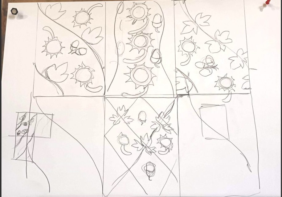
Graphic Design: Designing for Fabric. At our #dupontartclub Wednesday class, Caroline discussed the thought processes and construction of a design, and then demonstrated using graphic conkers, ivy and acorns imagery. The application for domestic fabric and wallpapers requires a repeatable design, various ideas of which were demonstrated and different example shown. The function of the designs requires thought as it will determine the style of image, the pattern, size and direction of the repetition, colour and tonal values amongst other considerations. Then the designer works on some ideas - producing thumbnail sketches and assessing them against these criteria - to then have the basis on which to work. In the discussion, Caroline showed various photos of existing graphic patterns, highlighting the popular styles of Laura Ashley and William Morris.
Capturing Texture in Driftwood using Watercolour
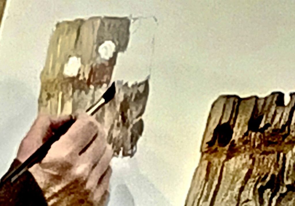
A demonstration on capturing texture in driftwood using watercolour Careful observation is key to the success of this still life. Dupont instructor, Caroline Marsland, laid down an underpainting of the lights and darks of the wood using the brush strokes vertically in the direction of the grain. Then using the tip of the brush to tap in lightly and wiggle to interpret the organic texture, marks and colours. Both wet in wet and wet onto dry techniques were used to allow the watercolour paint to move and blend softly, whilst following the direction of the grain as before. Some small patches were left unpainted at this stage. The next layer was painted when the underpainting was dry, to build up the texture and reinforcing the tonal values; mixing quite dark colours for the deep grooves and holes in the wood, and using a clean damp brush to lighten the palest areas. Surface texture was achieved by using the brush handle to lightly score the paper, which causes the paint to pool in the scratches. Finally, the holes and the side of the driftwood were worked on with more dark pigment to create a three dimensional quality. Any areas which had dried too light were also rectified. The demonstration was done using only one brush - a good quality squirrel hair number 12. This both holds plenty of paint, and retains a good pointed end for the smaller marks.
Painting like Cezanne
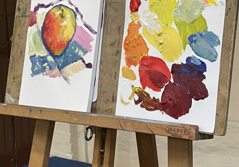
‘ Painting like Cezanne ‘Paul Cézanne was a French artist and Post-Impressionist painter whose work introduced new modes of representation and influenced avant garde artistic movements of the early 20th century’. Wikipedia Our instructor Caroline Marsland demonstrated and talked of the way Paul Cezanne painted. He looked for structure and forms in his paintings with the shapes and tonal values. He moved away from from browns and earth colours to working in saturated colours. He often would start with drawing the overall shape, often in a dark line and then laid each colour next to each one without blending. At times the paint was thick to add texture. With the highlights he would not use white as it looks flat so adding a little warm colour like pale yellow would warm it. More of Cézannes history is as follows. ‘While his early works are still influenced by Romanticism – such as the murals in the Jas de Bouffan country house – and Realism, Cézanne arrived at a new pictorial language through intensive examination of Impressionist forms of expression. He altered conventional approaches to perspective and broke established rules of academic art by emphasizing the underlying structure of objects in a composition and the formal qualities of art. Cézanne strived for a renewal of traditional design methods on the basis of the impressionistic colour space and colour modulation principles. Cézanne's often repetitive, exploratory brushstrokes are highly characteristic and clearly recognizable. He used planes of colour and small brushstrokes that build up to form complex fields. The paintings convey Cézanne's intense study of his subjects. Both Henri Matisse and Pablo Picasso are said to have remarked that Cézanne "is the father of us all". His painting provoked incomprehension and ridicule in contemporary art criticism. Until the late 1890s it was mainly fellow...
Drawing hands
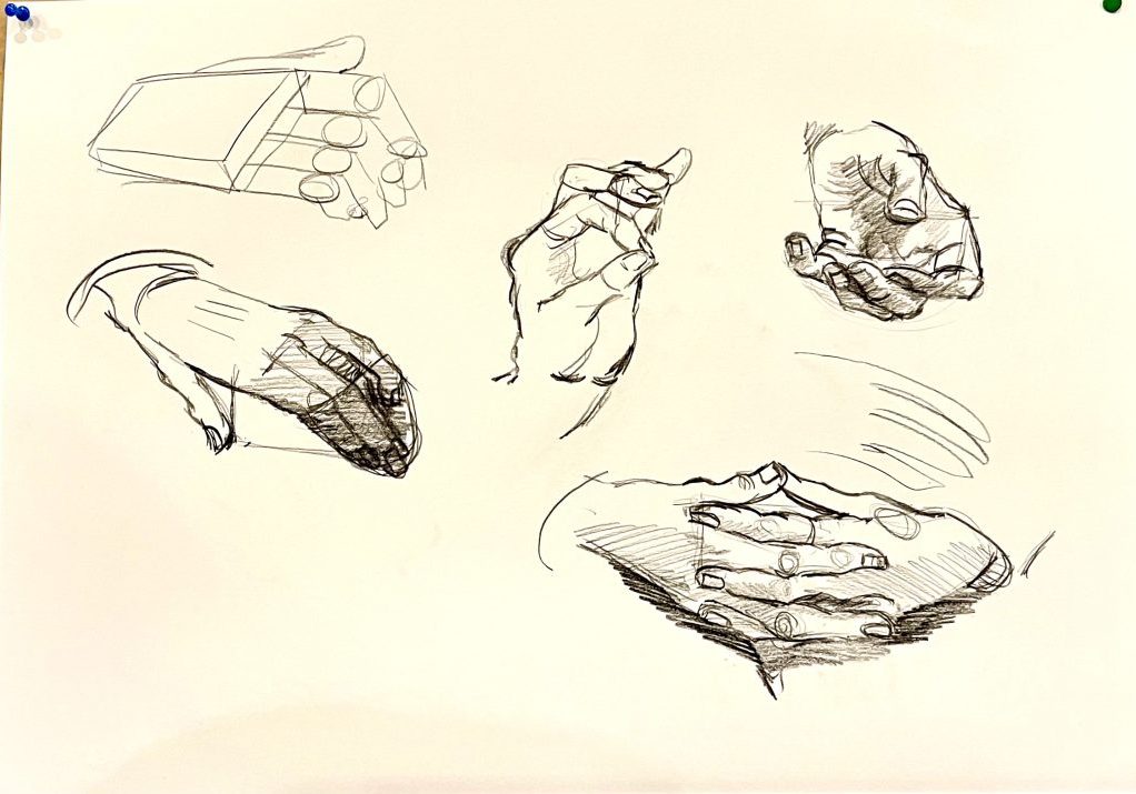
Caroline started the new year with a quick demonstration on drawing hands. Drawing hands start with drawing shapes composed of rectangles. . The palm is the largest rectangle . The fingers are made up of three rectangles built on each other. The end of the finger has a smaller pointed rectangle. The thumb is place on the side and it too is made up of three parts.. Move the finger shapes according to the model’s hand and make note of the knuckles which lay next to each other and are rounded.The tendons fan out from a central point to the fingers Depending on the shape of the hand, you will need to take into consideration of perspective which can shorten the shapes coming forward. Practice is very important in helping you to learn to draw hands accurately
Timed sketches
TIMED SKETCHES (1 minute/5 minutes/15 minutes). Caroline used charcoal and pastel paper. Pastel paper gets the best from charcoal as it has more ‘tooth’ giving stronger tonal values. Why timed sketches? The time limitation makes you really look. Concentrate on the line. Look at shapes, the major shapes, and corresponding shadows. Time restriction limits being tentative. Bold strokes. Do not look at trying to make a representational drawing, in the time allowed, rather to create an impression. Example One: The 1-minute drawing will be rougher but more expressive. Longer drawing times allows more detail. NB: Not seeking to create the ‘perfect’ image. Example 2 Cross hatch with charcoal and darken background areas – this can be very expressive. Draw a vertical line and then create shape (two halves) to represent vase. To bring the object forward ‘colour’ the background black – this will make object stand out. Example 3 The 5-minute drawing allows thought about details, for example shadows under the cream of the cakes. Study the light and dark – isolate the lighter areas. Charcoal allows blending with fingers or rubber. Look for tonal values. Initially get shapes down first and then shadowing. There is a balance with getting more details recorded but avoiding ‘fiddling’. Try to keep the drawing ‘loose’ - remember not seeking perfection. Example 4 The 10-15 minute – keep in mind this remains an exercise in observation. Extra time allows for more study particularly seeking out the horizontal and vertical shapes. Use a pencil to measure what is higher, lower and distances. Once shapes established start blocking in tonal values. Think of the picture as a jigsaw where each shape reveals the whole. Charcoal drawings can be used to emphasis the mood rather than a representation alone.
Paint like Picasso
#Caroline showed Various works done by Picasso to show the different stages of his work. Initially Picasso was traditional in his portraiture.Eyes to direct to the viewer and skin colour was authentic. The second image shows he is starting to play with colour (NB the colour wheel was invented in 1850) Picasso would have studied colour theory.. He began to use the method of outlying in black to bring objects forward. The next image is of a girlfriend and shows him moving aspects of the face, playing, looking at angles and probably walking around her. He sought to make colours harmonious making the background ‘warmer’ which brings the chosen and principle colours forward. Picasso is now exploring shape and form. he begins to distort the image for effect and also produces images which have an emotional impact. The next two images of Picasso’s work are perhaps more playful or extreme in the sense they seeks to portray character or the painters view of the person being painted. The face is further distorted showing the person’s character or the painter’s reaction to the person. Caroline then found an image of a woman and cat and altered it to be a representation of how Picasso might have worked. The pallet of colours was -green, yellow ochre, red, blue and blue and purple to make black. Initially she painted the face white. She then concentrated on the nose, painting it red and made it into a representable shape.She simplified the shape, Blue for eyes (just one) and started to look to form patterns. She outlined the shapes with black, enclosing shapes. She also added details such in eyes and teeth. the aim was to be playful and reduce the image to a series of shapes. Picasso...
Tonal Values in Portraiture
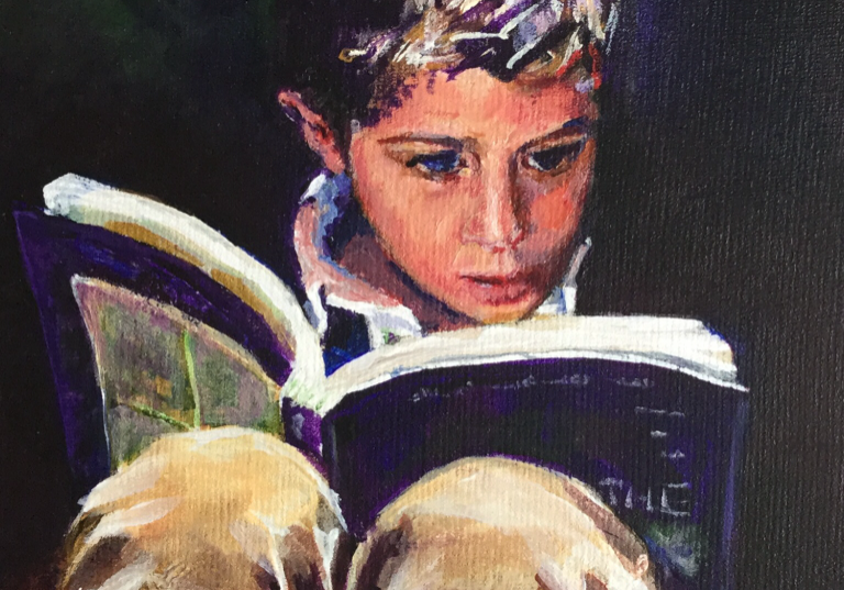
The demonstration started with a spectrum from white to black - many variations Using pencils 7b and 8b Mars Lumugraph - Caroline found no shine but sticky Going from light to dark adds drama In portraiture tonal values offer impact especially around the eyes with paper left white (see example drawing) Examples: Monet and Caravaggio Also if drawing a street lamp a dot of light in centre of lamplight adds drama Always start faint and work towards dark This particularly the case when Hatching and round hatching can define contours of face or object (see example drawing) Look for shapes and where shadows lie Tonal values give drawing perspective In photo Caroline left white area down nose Changing direction of the hatching can give movement Squinting is good - as you can see white and darker areas more clearly appear in “blocks” The darker areas will make the white stand out Shadow can change expression and structure of face “Shadows never completed until tonal values established” There is always the danger of it looking “over worked” - but this is part of the learning experience Tonal values give the face 3 dimensional Work slowly from light to dark Rubbing out can smudge The aim in portraiture is to get the expression or the feel of the person Not aiming for a photo as such rather capturing the essence of the person In example the hair line draws the eye down the face Find the shape and structure of face by “measuring” distance with pencil
Drawing, The basic skill for good art.
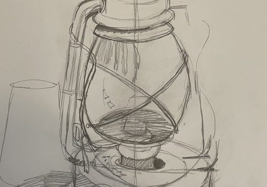
Our first demonstration in 2022 was about drawing. This skill is essential to make good art. The more you look at an object the more you get to know it so it is very good to sketch first before proceeding with the finished piece. Draw what you see not what you think is there. Squinting will help you to do this. You should start drawing the main shape and ignore the details. Start in the middle of the object and work out. You start this by lightly sketching the shape with pencil. Once you are happy with the accuracy, darker lines can be applied. You can estimate the angles of your object using your pencil. By drawing a line down the middle of your drawing you can paste dots on the outer edges of the object . To ensure that it is vertical place the pencil along the edge of both sides of your paper to ensure that your drawing is vertical. Once you have your drawing underway look at the shapes in between your lines which are referred to as negative shapes. This can help with the accuracy. When you draw still life, draw the nearest object first and then follow with what is behind. Continue to draw in order to improve your drawing skills and enjoy. .Practice, practice, practice! Sketching from light to dark with center line. pencil strokes from light to dark
Geli Pad Workshop
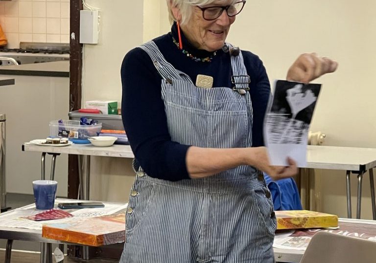
On November 18th twelve Dupont members attended a Dupont Art Club workshop taught by Seana Mallen on Geli Pad Art. She introduced the supplies being used including two sizes of geli pads, acrylic paints, rollers, and many types of papers including old maps, music, and tissues. She also showed us how to make a concertina book for our work. We were told to bring various leaves and objects to make makes on the pads. The art was approached with enthusiasm and soon produced a variety of small pictures. A number of members were excited about following up this type of art printing and painting in the future. The deli pads are available at many art stores and I found that Lawrences Art in Hove had discounted many of their geli pads for those interested in following up with this delightful way of painting.
Watercolour Landscape Techniques
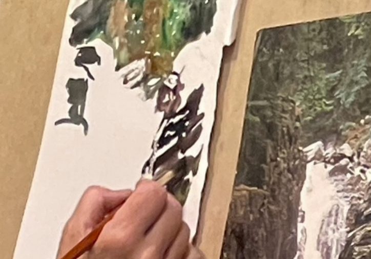
Watercolour Landscape Techniques Our instructor Caroline Marsland leads us through a demo every other Wednesday at the Dupont Art Club. This week she gave a demonstration on how to paint a loose, different landscape. Materials used: Watercolour paper, salt, clingfilm, candle Wax, scratching materials, various paintbrushes. She started our drawing out white areas with candle wax which blocked out the background. She proceeded to paint in the landscape background with watery watercolour which she covered in clingfilm. She crunched it up once laying it down on the wet watercolour. In other areas she painted in watercolour and added course and fine salt. These were all left to dry. Once dry, the cling film was removed along with brushing off the salt crystals. She splattered back into some areas and scratched back into others.These techniques have left the watercolour mottled. She painted detail back into smudged areas and added more darkened areas to bring out the lighter areas. Enjoy playing with ease techniques.
Dupont Video Workshops

You can see Art Tutorials on Dupont’s You Tube by Dupont Art Club's two excellent instructors, Lucy Parker and Caroline Marsland. This is an excellent way to keep your painting skills up. Please click on the link below and start painting. Dupont Video Workshops If you have any comments or would like advice, please contact the tutor Lucy Parker lucy@lbparker.com Caroline Marsland caroline.marsland@gmail.com
Charcoal drawing by Caroline Marsden 11/03/20
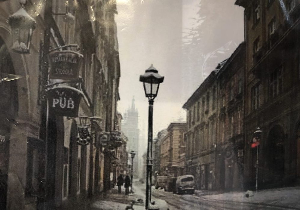
Charcoal as a medium lends itself particularly well to moody urban landscapes. Caroline decided to draw this snowy street scene Using Windsor and Newton charcoal, which is a good quality with velvety texture, Caroline began by blocking in the shapes of the buildings. She then lightly rubbed over the charcoal to smooth it. She applied the charcoal across the road and then used a rubber to erase the tyre marks and show the snow. She went over the buildings to outline the edges and put in marks for the windows and the arches. It is important to keep your marks consistent as this will make the drawing harmonious. She determined that the vanishing point was at the meeting of the two sides of the road in the far distance. She then drew light diagonal lines out from the vanishing point to the edges of the paper to get the perspective right. The focal point of the drawing is the lamppost as it is the area of greatest contrast as it stands out against the bright sky. Caroline went on to use a thinner piece of charcoal for the details. She put in the snow on the bicycle , and on the signs by using the rubber. Remember it's easy to rub out and redraw any areas you're unhappy with until you get the desired result.
Still Life by Caroline Marsden
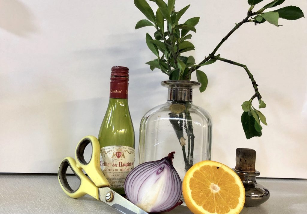
Start out by choosing your main object, then you can add interest by selecting additional objects which compliment this. It's probably best to have a theme, which can be anything - the possibilities are endless. You should use an odd number of objects as this is more appealing than an even number. Make sure you have variety in size and shape as well as colour. When arranging the objects try to ensure that you use the shapes to lead the eye into and around the image. A square format works well for still life, but depending on your subjects you can also use portrait or landscape. Good lighting is essential and it may help to position an Anglepoise lamp to get good shadows which create tonal value. This is the still life Caroline prepared She started by lightly drawing the main object in outline which was the large bottle, which she positioned slightly right of centre. Next she drew the small bottle outline, noting its size and shape relative to the first object. Continuing, she added the onion the orange and the bottle top, carefully checking where objects overlapped. The scissors were then drawn in very carefully, as the long point of the blade is used to lead the eye . When trying to place an object at an angle like this, it may help to hold your pencil horizontally up towards the object and tilt it to the required angle. Then place the pencil at this angle on the paper. Don't use an eraser if you are unhappy with the positioning, just redraw in the correct position next to it. The danger of using an eraser is that it is easy to redraw the same mistake once you've removed the original. Once all your outlines are in you can...
Painting or drawing upside down by Caroline Marsden

It is a good idea to try this as an exercise to change the way that you look at things. By working upside down you draw only the shapes you can see and not what you think should be there. Caroline started by using this photograph pinned upside down You can, if you prefer, simplify things by splitting the photograph into four to help you in positioning. Using a 7B pencil she first drew an ellipse ( representing the tabletop ). Using this shape to work from, she went on to put in the oblong shape underneath and the black square to the left of that. From there she entered the curves which take the eye down from both the square and the oblong to the bottom. She continued in this way, plotting in the main larger shapes. After all the main shapes were done she moved on to the more intricate parts. This is done by paying close attention to where things are positioned relative to the other main shapes already done. This really will hone your observational skills. Finally think about adding tonal value. Caroline used an 8B pencil to shade in the darkest areas first then the lighter areas using a variety of hatching and crosshatching. Only when she had finished did she turn the drawing the right way up. this was a very good representation of the original photograph
Brush strokes demo by Caroline Marsden
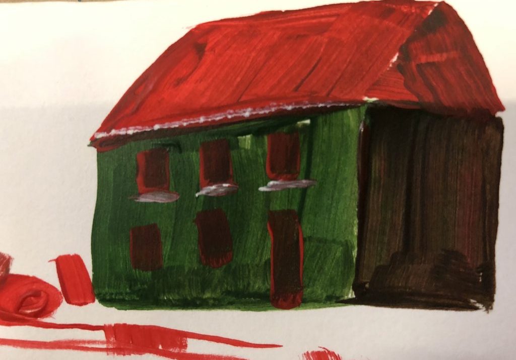
FLAT BRUSHES These can be used for a myriad of different effects. They are especially useful for painting buildings or any other subject which has straight edges, and are economical with the paint as often only one stroke is needed. A BRIGHT is a shorter and stiffer version of a FLAT which will give you bolder strokes. A flat brush is great for getting perspective and you can gently tap it to get a nice thin line as shown in the guttering and windowsills above. Don't throw away your old ones as these can be used effectively for texture , fur or feathers. A FILBERT is a flat brush with curved sides, great for giving a softer edge such as in clouds or petals. Caroline holds the brush at an angle to the paper and tries to touch the paper with only the paint, not pressing down too hard on the brush. A FAN BRUSH is a specialist brush for doing texture, fur and feathers. Bob Ross can be seen on YouTube demonstrating painting fir trees using this brush. A ROUND is the one of choice for Monet and is useful for short expressive strokes. If you use a large one it can hold a lot of paint and be a good choice. A FAT HOG is an enormous brush which holds a huge amount of paint and is very good for stencilling A RIGGER gets its name as it was first used for putting in the slender rigging of boats. This is best used with really thinned-down paint making sure the brush is well loaded and with a good point. You an also use this for hair and fur but it's best to use it for the finishing touches as it would be quite time consuming to draw...
A winter scene in watercolour using only Sienna and Ultra Marine 11/12/19
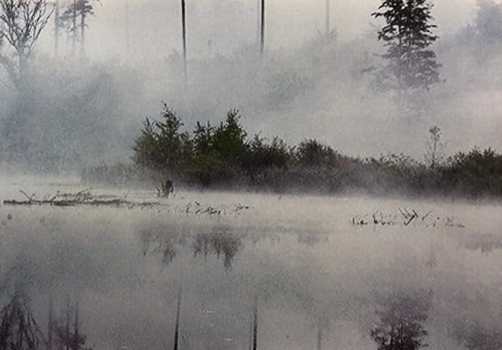
Caroline chose the two colours of sienna and ultramarine blue as they can be mixed in many different ways to give you both cool and warm colours. The group selected this photo for Caroline to use as her inspiration. When starting a watercolour it is best to work from light to dark. Looking at the picture, first determine where your lightest areas are. Caroline was using White Knight watercolours and a large round brush with a good point to it. She began using a dilute sienna for the sky and the reflection, and let this dry. She then mixed two shades of grey using both colours . She began to put in the tree line using the lighter colour. She used the brush in small upward strokes moving along the tree line. Then she drew up the water in a horizontal stroke to avoid a harsh line. She went on to add a darker line underneath for more tonal contrast. You may need to revisit the darker area as it will dry lighter. Once happy with the top part she went on to do the reflections carefully putting them in the correct position .Using a dry brush she put in some texture. She put in the darker trees using a rigger for the trunks and finally the darkest trees . She decided that the little island in the foreground would be the focal point, so she painted this in a warm tone using only sienna at first. She added some more sienna to the parts of the painting for cohesion. She put in the ray of light by swiping a tissue in a diagonal line which was very effective. Finally she put in a ghost wash to of ultra marine to add mood to the background.
Painting a Christmas Card 27/11/19
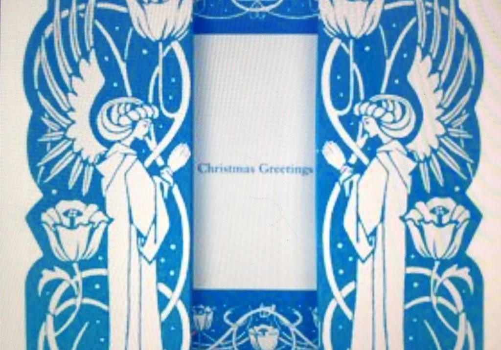
Caroline suggested that to get inspiration for your card it is a good idea to have a look at cards from earlier years. Christmas cards have evolved in their design from the Victorian age to the present day. We looked at several different cards from the Art Deco to the war years , here are a few examples:- Caroline decided on a stylised angel for today's demo. She started by drawing out the shape to fill the card using the angel wings to stretch up into the corners. She then chose a focal point which in this case would be a light being carried by the angel. Next she angled the lines of the wings so that they drew the eye to the focal point. You can find many different styles of angel on the internet on which to base your own creation. Once happy with your outline you must choose your colours so that the angel comes forward in the painting. Caroline started with a turquoise wash on the angel's robe and then used a cobalt blue for the background. She mixed a warm red to add interest to the robe. The light is then added using a bright yellow and this colour is also added to the angel's halo and as reflected light on her wings. This was just a quick sketch from which she would go on to produce the finished card. If you would prefer to make a humorous card , again there are many examples on the internet. Last year Caroline made a card for her friend who had a cat called Jack. She drew Jack as a Christmas tree with his little paws holding candles and a fish shaped Christmas present under the tree.
Importance of negative spaces by Keith Manning Kennedy
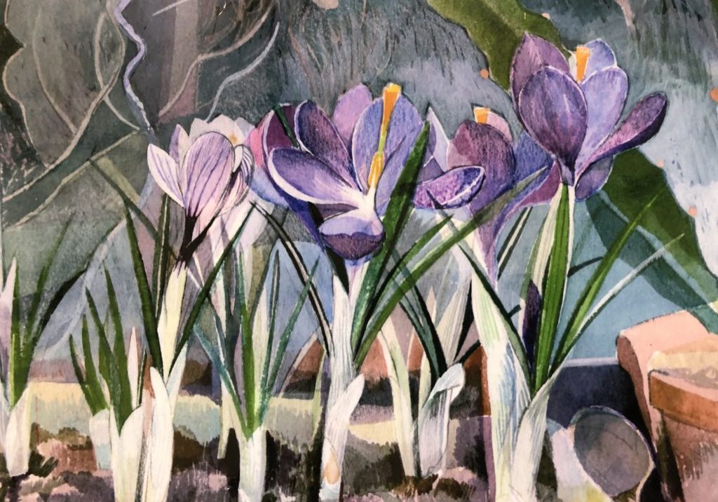
Keith started by mapping out the outlines of fuchsias in a vase using a 4H pencil. To create more interest in shapes and colour he added in two butterflies. He then carefully painted in the background by filling in the negative spaces between the flowers and leaves. Remember that the shapes created by the negative spaces are themselves a very important element in your mosaic of colour. As he was painting a brightly coloured piece, he made sure to keep the background a subtle complementary colour. In this case, a pale blue to bring out the magenta in the flower. Old Holland permanent rose and permanent magenta were used for the fuchsia. Always use a freshly mixed paint and don't be tempted to use some old ready mixed paint from your palette which may have become tainted. He used a green gold colour for the leaves. Using a filbert you can get a nice fine line when needed and also get enough paint on the brush to fill in the spaces; a sable brush is well worth the money. For the more intricate little areas he used a small flat brush and if needed turned the painting upside down to let the water move around within the correct area. If you do get a small puddle forming, dry off your brush and use the brush to soak up the excess. In watercolour the general rule is that you can apply up to three layers of colour after which the colour goes dead. If this happens you can always get yourself out of trouble by going over it with a lighter shade of pastel or pastel pencil as used in this example. Failing this you can paint over with a thick layer of white gouache then wait for this to dry...
USING OIL PASTELS 16/10/19
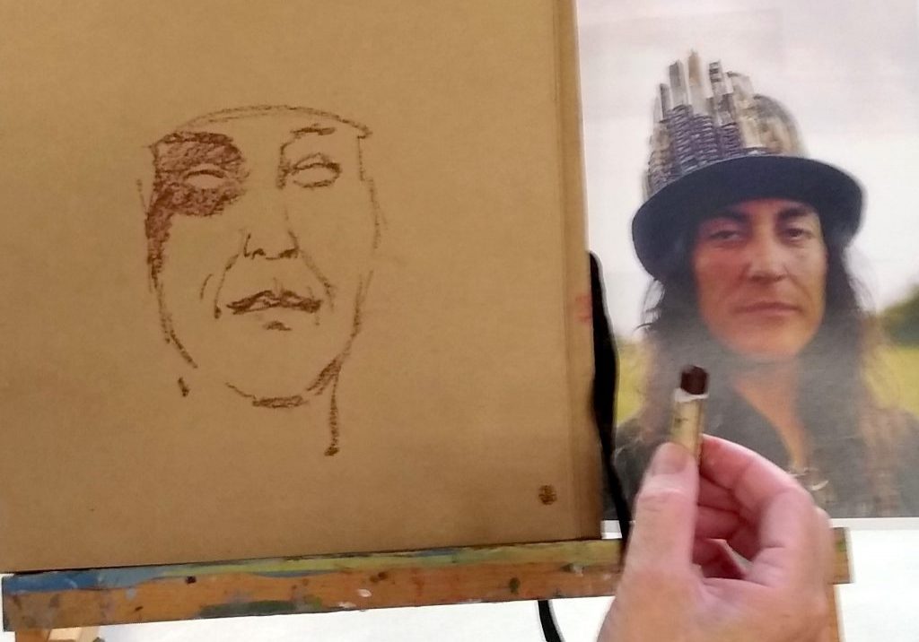
Caroline introduced a session on oil pastels by saying that it is wise to use the best quality pastels. The ones she had were Sennelier (£3.50 a stick, or can be bought in boxes). For paper, a rough surface is needed and she was using a brown paper scrapbook (Seawhites).Caroline had a photo portrait of a long haired Roma male as her model for today’s demonstration. Beginning with a dark brown outline, Caroline sketched his features with the edge of the pastel. She blocked shadows with dark brown, followed by red and green reflected on one side of the face by the grassy background. The green was toned down by use of yellow ochre on top. Various colours were applied and built up either by layers of pastel or by blending with fingers. A useful tool was a paper pencil-shaped blender, which could be dipped onto the pastel to pick out small delicate areas. This method was useful for sections of the eye, such as upper and lower lids, and for the light reflected in the iris.
PAINTING ROTHKO AND COLOUR THEORY 2/10/2019
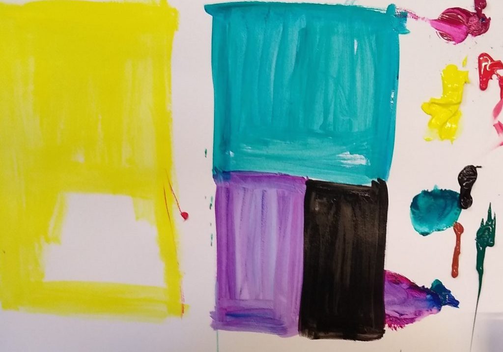
Mark Rothko. B 1903 D. 1970 Markus Rothkovitz was a Latvian of Jewish descent. His family emigrated from persecution and settled in Oregon in 1913, where he started painting. In 1920 he moved to the New York Art School where he became anti-establishment and was influenced by Klee, Cezanne and Picasso. Rothko taught children for 20 years. He liked the simplicity of children’s art. In the 1950s his art became completely abstract, using blocks of colour and influenced by the Fauvists. In the 1960s he used blocks of intense colour, following which he suffered from depression, reflected in his use of darker colours with less luminosity. Demonstration Caroline chose a thick first coat of yellow, then mixed Phalo green and purple as a compliment to the colour wheel. Then mixed an intense orange and placed it into the yellow square. There then followed a succession of different choices of colour to illustrate the effect of one colour on another.
Painting in the style of Vincent Van Gogh
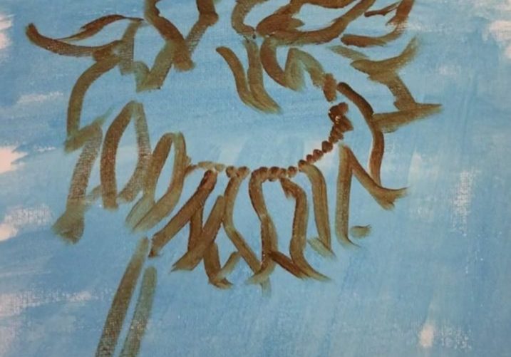
Van Gogh was born in 1853, and had a tormented life with a lot of anxiety. It is possible that he may have been a manic depressive. He only started painting aged 27 and tragically died aged only 37. However during those 10 years he produced roughly 2,100 pieces of work. His early work was very dark and his younger brother who ran an art gallery in Paris advised him to change to a brighter palette. He therefore evolved from the Potato Eaters to his much better known works like the Cafe at Arles or his famous Sunflowers. His favourite colour was yellow followed closely by cobalt blue, which together make for a striking painting. He had a unique style of painting which was driven by emotion. He used various brush techniques including contour painting and pointillism. His famous Irises were painted much more flatly using the silhouette method of outlining the subject first. Caroline started her painting of sunflowers by a background of a pale blue colour onto which she painted the outline of the sunflower in a light brown. Then she mixed up 3 shades of brown and using small expressive strokes she quickly filled in the centre of the flower. Next, she went over this with a darker shade of brown for depth. Van Gogh would have done layer after layer using very thick oil paint straight from the tube. After this, she filled in the petals with a dark yellow colour using swift expressive strokes. Using a filbert she went over the background with a strong blue and then mixes of white and blue and green and blue making sweeping strokes to create movement. Then she went in with a paler yellow on top of the petals , leaving some of the original colour showing through....
Acrylic and Collage

Collage was first used as early as 1910 and Picasso did some collages. Collage is a great way to add new dimensions to your paintings. The list of things you can use in collage is almost infinite, but here are some suggestions :- Natural things like - shells, stones, pieces of broken glass, seeds , lentils, rice, dried beans or dried grasses - just be careful not to use anything which might go mouldy. Household things like - keys. zippers, jewellery, coins, washers, screws, bolts etc. You can also use newspaper, wallpaper, gift wrap, sheet music and cut-outs from magazines. Note that it can be difficult to paint on top of any shiny magazine clippings. You can either start your painting by using a lovely piece which inspires you and then incorporate this into your painting, or you can use the collage to enhance a painting or give an interesting background to it. Caroline started with a striking photograph of a young african woman, then she selected cut-outs from magazines to add a lively dimension to her painting. The finished painting can be mostly collage or 50/50 or any proportion you feel works best. Once you have your theme it is best to choose items to use as collage which are related to it. Caroline recommends using wood glue to stick on your items as this is very strong and nothing will fall off when the painting is hung. This was her photograph She mixed up some thinned paint, diluted with some glaze medium ( this is a good chance to use up your cheap paints as they are low in pigment) and applied this on top of the collage so that the pattern showed through. She then continued to build up layers. How much paint you apply and how...
Building an Acrylic Painting with Layered Washes
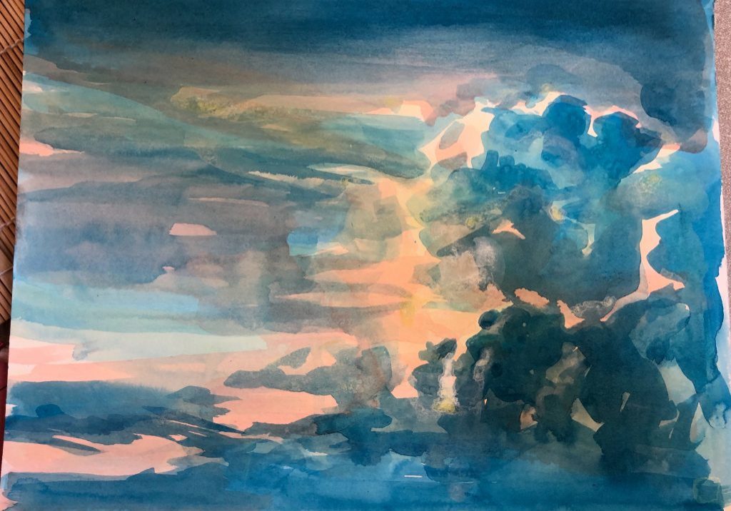
Guest instructor, Zara, introduced her favourite method of developing an acrylic painting by using many washes to slowly develop the picture. She said that this meditative process left a painting which was both translucent and in a illustrative painterly way. She used two subjects to paint at the same time so one could dry while the other was being repainted. Before starting, she mixed a small amount of acrylic paint colour in a little water. She had several pots of these mixed colours which she cautioned us to mix well to get rid of the lumps. They had the consistency of creamy milk.. These little containers of watery colours were her paint pallet. She then drew the object (apples) and sky landscape first with a light coloured watercolour pencil. She then used a flat brush to paint in the apples and sky with a light colour and let dry. She began to layer the colours to develop each of the pictures. She followed the shape of the apple with her brush strokes. She warned us that this type of painting could require 20 or more layers so would require patience. She only had time to paint about 3 layers with each picture and said that they would require at least another dozen layers each. We began to see the potential after only three layers with some lovely luminous colours being produced. Many of the members used the rest of the afternoon practising this intriguing method of painting with acrylics.
The use of a flat brush
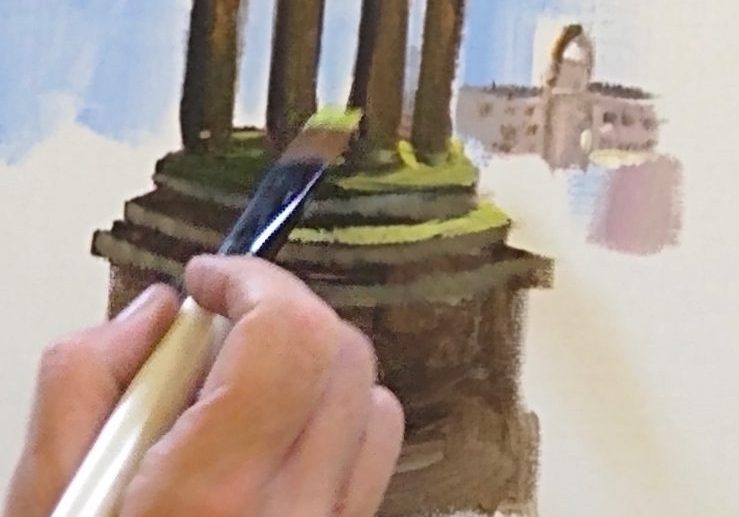
Brushes come in various shapes including round, filbert (a semi round top and great for portraiture), fan, angular, and the flat brush. Each has it's own uses. Caroline Marsland demonstrated the use of the flat brush at class. These brushes come in all sizes. She chose a medium and medium small to show how one could complete a landscape painting using this one shaped brush. A flat brush can make thick consistent strokes or when it is turned on it's side, will give you fine lines. It is great for blocking in solid shapes of color such as in the painting of the building shown in her demo. She also showed it's use in blocking in color for trees.
Sorry, we couldn't find any posts. Please try a different search.
