News and Articles
Read about upcoming exhibitions and see art demonstrations and art tutorials from Dupont Art Club.
Building an Acrylic Painting with Layered Washes

Guest instructor, Zara, introduced her favourite method of developing an acrylic painting by using many washes to slowly develop the picture. She said that this meditative process left a painting which was both translucent and in a illustrative painterly way. She used two subjects to paint at the same time so one could dry while the other was being repainted. Before starting, she mixed a small amount of acrylic paint colour in a little water. She had several pots of these mixed colours which she cautioned us to mix well to get rid of the lumps. They had the consistency of creamy milk.. These little containers of watery colours were her paint pallet. She then drew the object (apples) and sky landscape first with a light coloured watercolour pencil. She then used a flat brush to paint in the apples and sky with a light colour and let dry. She began to layer the colours to develop each of the pictures. She followed the shape of the apple with her brush strokes. She warned us that this type of painting could require 20 or more layers so would require patience. She only had time to paint about 3 layers with each picture and said that they would require at least another dozen layers each. We began to see the potential after only three layers with some lovely luminous colours being produced. Many of the members used the rest of the afternoon practising this intriguing method of painting with acrylics.
The use of a flat brush

Brushes come in various shapes including round, filbert (a semi round top and great for portraiture), fan, angular, and the flat brush. Each has it's own uses. Caroline Marsland demonstrated the use of the flat brush at class. These brushes come in all sizes. She chose a medium and medium small to show how one could complete a landscape painting using this one shaped brush. A flat brush can make thick consistent strokes or when it is turned on it's side, will give you fine lines. It is great for blocking in solid shapes of color such as in the painting of the building shown in her demo. She also showed it's use in blocking in color for trees.
DEGAS – Pastels with a twist

Degas was one of the forerunners in impressionism. He preferred to work in his studio, and was not impressed with his contemporaries who painted en plain air. Born 1834, he was a little older than the others. He was a trained draughtsman, who then went on to study at the Ecole des Beaux Arts. He was a highly skilled sketcher, who liked to capture everyday people. The new paint colours which were just becoming available were the main catalyst for the impressionist movement. Degas' compositions were dramatic and quite experimental at the time, as in " Dancers ", 1889. Caroline used the top left hand figure from this painting for her demonstration. She began by grating some pastels using a nutmeg grater Combining acrylic paint (Degas would have used oil paint) and pastel, she started the painting by using a dark pastel to form the outlines. She then put in areas of colour, blocking them in and also using scumbling. Scumbling is a method of putting one colour onto of another, but leaving some areas of the original colour showing through. All of this work is considered the underpainting Then, using a white pastel, she went over the face making the colours appear more flesh like. She used small strokes thereby mixing the colours on the paper. If your colours should come out too white at this stage you can add a bit of yellow. Working this way she built up layers , getting thicker and thicker. Finally using some flesh tone acrylic paint, mixed with some of the white grated pastel for texture, she applied this on top. She then mixed some blue grated pastel with the flesh toned acrylic paint, and so on with the other colours, until the desired dramatic effect is achieved.
Painting in the style of Monet

Caroline Marsland lead us in a demo of a Monet painting. She pointed out the Impressionists of whom he was most famous, were into seeing colours in their environment. `Monet painted with thick oil paint later stumbling with thick paint when his eyesite become poor. He used small strokes that blend often giving a feeling of a haze. His strokes for the sky were often verticle and the water horizontal. He often used a ground color of blue or cream. He painted at the lighter end of the light-dark scale. `his brief biography is as follows: Claude Monet, in full Oscar-Claude Monet, (born November 14, 1840, Paris, France—died December 5, 1926, Giverny), French painter who was the initiator, leader, and unswerving advocate of the Impressionist style. In his mature works, Monet developed his method of producing repeated studies of the same motif in series, changing canvases with the light or as his interest shifted. These series were frequently exhibited in groups—for example, his images of haystacks (1890/91) and the Rouen cathedral (1894). At his home in Giverny, Monet created the water-lily pond that served as inspiration for his last series of paintings. His popularity soared in the second half of the 20th century, when his works traveled the world in museum exhibitions that attracted record-breaking crowds and marketed popular commercial items featuring imagery from his art.

Making Eye Measurements in Painting

Instructor Caroline Marsland demonstrated how one could take measurements of the objects you are painting. She provided us with a simple picture of how to do it. Just using a brush or pencil, one can work around complicated objects or scenes more accurately.
Fish painted in watercolour

Caroline’s subject this week was “fish, painted in watercolour”. The vibrancy of the medium was well suited to this subject as can be seen in her beautiful rendition of a tropical fish. First Caroline lightly outlined the fish in pencil then applied the fish scales and part of the body in a light tone. She carefully left some areas without paint to be filled in later. The fish’s tail lent itself to some experimenting with use of paint. The tail was painted and then scored with the end of a paint brush to suggest lines and again some areas were left free of paint. While the paint dried Caroline applied a viridian green loosely to the background to suggest water and reeds. Contrasting colour was used as opposed to considering tonal values at this stage, whereas later darker tones were used to enhance the body of the fish. Finally the details were carefully painted in with a rigger and some of the white areas were washed over with a pale tone. Some of the painting was left to drip and flicking paint on the green gave it a watery feel. Thanks to Judy Richardson for photos and text.
The Zorn Pallet

On April 24th instructor Lucy Parker gave a brief talk to the Wednesday Dupont class on the zorn pallet used by many artists She described the colours used as yellow ocher, cad red medium. black and white. She said that in using oils, the dark colors should be laid down first. This was a brief outline of her colour mix. It is described as follows on line: "The Zorn palette refers to a palette of colors attributed to the great Swedish artist, Anders Zorn (18 February 1860 – 22 August 1920). It consists of just 4 colors being yellow ochre, ivory black, vermilion and titanium white. Cadmium red light is commonly used in place of vermilion by modern day artists. Whilst this may seem like an extremely limited range of colors, Zorn demonstrated through his paintings just what is possible with such a limited palette. Here are some of his paintings which appear to utilize the Zorn palette:"
Using a Grid for Complex Subjects
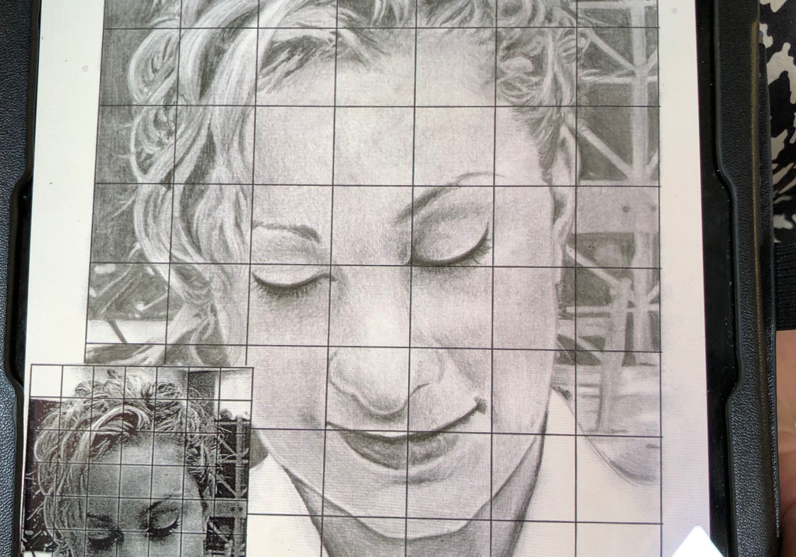
Lucy was our instructor for the Wednesday class and took us through the use of grids when drawing accurately. Anytime you want to draw something that requires accuracy such as a portrait, pet, vehicle, a complex still life, etc. we may wish to use the grid method. It starts with drawing a grid of squares over the photo of the work you wish to copy. These squares can be numbered and lettered to make it easier to follow when drawing. Next you then draw the same numbers and letters of squares onto your drawing paper/canvas. You then carefully copy each square from the grided photo copy onto your painting/drawing surface. Be careful at the corner of the eye and bridge of the nose as these can be tricky. If you don't wish to mark the photo you can always copy the grid onto clear acetate and layer it onto the photo. There are also various grid drawing assistance apps on your tablet which you can download and layover the photo to be copied.
Pen and Wash demonstration by Caroline Marsland 3rd April 2019

When selecting a paper for pen and wash, a smooth hot pressed watercolour paper is best, as rough watercolour paper catches on the pen. Caroline chose to work with India ink, you can also use Quink. She doesn't recommend hobby craft ink, as it can wash off when your wash is applied, whereas the India ink is permanent. She prefers to work with a mapping nib rather then a drawing nib, which can be a bit scratchy. The joy of using a dip pen is in the good expression you can get from the different thicknesses of strokes. First, think about what part of your painting is going to be pen and what part wash. You may want it mainly one or the other. This is the photograph Caroline was working from ( it's the steps up to Whitby Abbey) Caroline chose to start with the pen, as this gives the most freedom of expression. You should look for where the light is coming from and then make your lighter strokes on the side that is getting the light. She started with the lamppost as this was central and then worked out from that. Remember it doesn't have to be perfectly drawn; it is your impression of the scene. If you prefer, you can draw it out lightly in pencil first. Dip pens are good for squiggles and shapes to suggest bushes. You shouldn't try to put in every line. A few details are all that's needed and the viewer fills in the rest. If you have an accident and get a splurge on the page, this can be covered using white gouache. The distant subjects should be drawn lighter with the heaviest lines saved for the foreground. Caroline used a rigger for the railings to make them stand out....
OIL PASTELS DEMO by Caroline Marsland

Caroline brought oil pastels by Sennelier, which are an excellent choice as they are pigment rich and a delight to work with. Cheaper brands such as W. H. Smith are not so good as they are all wax and hardly any pigment. Sugar paper is a good alternative to the preferred pastel paper and is cheaper. The most important thing is to use a paper with a good tooth to hold the pastel. Selecting a colour that is closest to the mug to be painted, Caroline started by drawing a central vertical line to aid in the drawing of the mug. She then used good observation, not forgetting negative spaces, to make an outline of the mug. She squinted to see the reflected colours in the mug and then blocked these in. You can mix the colours on the paper, and then these can be deepened or lightened by layering until the desired hue is achieved. You may like to use your fingers to blend. Caroline then worked the bottom half of the mug, building up layers . She made the inside of mug totally black as it appeared and then using the edge of the white pastel she put in the highlights round the rim and on the handle. She also used a torchon to make additional highlights and other small marks of colour. You can take off marks made with oil pastel using this tool, unlike chalk pastels (unless you scrape them off!). Using this tool she pulled out nice shapes in the reflected colours .
Still Life in Charcoal Demo by Caroline Marsland 6th. March 19

Before starting the drawing, Caroline gave a few tips on working in charcoal: Sandpaper the paper for dramatic marks Use good textured paper Think ... Where are my darkest shadows going to be? WORK BIG! Blocking in very lightly, Caroline sketched out the group of bottles. Using light strokes to plot the work makes it easy to erase, should it be necessary. Working dark to light she used heavy marks to start with, noting that wonky lines and random marks make it more interesting. Using a small piece on its side, dark areas were blocked in and the fiddly bits (little shapes) were made using the end and the edge of the charcoal. At this point Caroline suggested working quickly, so there is "no fiddling"! To make the image livelier, the background was strengthened, using strong lines and shadows. Hatching is another useful technique to introduce texture. An eraser can then be brought in to remove parts of the darkest areas, in this case to give the shine on the bottles. Chamois leather can also be very effective instead of an eraser. Thanks to Christine Elsdon for the notes and photographs.
Charcoal portraits

The best charcoal to use is Windsor and Newton as it has good deep coverage and is just lovely to use. Always break the stick into a smaller piece and then you can use it side on or using a corner. You should use a rough paper with a tooth to give the charcoal something to catch on. Pastel paper is ideal for this. When tackling a charcoal portrait, you should first decide which method you want to use. Caroline demonstrated both using shadows to define your shapes, and later drafting out your image using the charcoal a bit like a pencil. She started by covering the entire paper with charcoal lightly, then she put in all the large shadow areas like the eye sockets and under the nose and the outline of the head. Next she used a rubber to erase all the lighter areas of the face and eyes and put in all the highlights. She frequently rubbed it on a piece of sand paper to clean the rubber. She used careful observation to ensure that the facial features were correctly sized and positioned, taking note of measurements of spaces between nose and mouth, eyes and nose etc. It's just a matter of making continual adjustments until you are happy with the end result . Remember you can rub out and replace the charcoal as often as needed. You may prefer to use a charcoal pencil for the finer details, Caroline herself just used the corner of the stick of charcoal. You can also use your fingers to blend it. The little girl was done using the drawing technique with the corner of the charcoal and then blending with the fingers.
Watercolour Painting of Patterned Fabric

Caroline Marsland took the Wednesday Dupont class through how to watercolour paint a patterned fabric on paper. We were not painting the fabric. She started off by lightly drawing the general shape of the fabric lightly with pencil. She then painted in the the colour of the fabric first with all of the shadows that are in it. She layered the shadows for best effect and used tissue paper over the wet parts to show texture at times She worked away from the centre with a wet in wet technique. For the really white areas, she suggested using masking fluid. You need to exaggerate the shadows because when you put the pattern in, they will disappear somewhat. Once the background is dry, she said to very lightly draw in the pattern first with complex patterns but with a simple pattern, she just paints the patters in. Some suggestions: Remember to sqint, She painted from light to dark to light as needed.
Painting with Charcoal and Watercolour

On November 14th instructor Caroline Marsland did a demo on painting using charcoal and watercolour. This was done on 140 pound watercolour paper. This medium is good for moody pictures. There is usually a tinge of charcoal in the watercolour leaving a shaded picture. She used a piece of charcoal but using a charcoal pencil is fine. Caroline started off with a drawing of the shadows in dark charcoal. She used a loose dribble runny wash for the sky. In order for this not to run into the foreground, she turned the painting upside down to prevent this while painting. Once it is dry, she overpainted it to give it a darker, more dramatic look. The foreground was painted with watercolour which blended into the black charcoal shadows. The overall effect was a quick moody picture of moody stones.
Painting leaves in watercolour and in acrylic by Caroline Marsden

When working in watercolour you should always work light to dark. Caroline started by lightly sketching the outlines of the leaves in pencil and then she used masking fluid to map out the main veins. Then it was left to dry. Using a round brush with a point she started by putting a wash of yellow with a little red over the entire leaf. While it was still wet, she dropped in a red mixture around the edges of the leaf, letting it do its own thing. Next she put in the green, using a bright green mix (cooled down with a little bit of the yellow wash). Using a clean brush she pulled out some veins from the still masked area. Next, she put in the leaf tips using a dark brown and a rigger. If at this stage you can see that your colours are not strong enough this is easily rectified by first adding water, then dropping in more of the desired colour. When you're happy with the painting rub out the masking fluid with your fingers. Then paint in the veins using a pale yellow and finishing with a dark reddish brown. Below is the leaf still with the masking fluid. If you don't want to use masking fluid you can carefully paint around the main veins leaving them as white paper, as with the small leaf below. You can then simply go in with a bright red paint for the vein and a darker colour underneath for depth. The picture shows the final paintings using both methods When using acrylic you should work from dark to light. Caroline started the painting by outlining the leaves using Hooker's green. She mixed three shades of green; dark, medium and light. She first painted on the...
Painting a still life in acrylic by Caroline Marsden

When tackling a complex subject like a vase of flowers, it's a good idea to draw the outline of the entire thing using a dark colour. Start the outline by placing your main flowers ( the ones that are wholly visible ) first and then moving on to the partially visible ones, moving round and outwards till you have captured everything. Now you can move on to painting the flowers. Start by painting the background, then the rearmost flowers, so that you can paint the main subject of the wholly visible flowers on top of the background ones. Caroline advised buying a high quality yellow paint as it often is very difficult to get a good mix using the cheaper ones with less pigment. She mixed three shades of yellow using lemon yellow, yellow ochre and white. Adding the white makes the colour more opaque and also stops it becoming too acid. You can also add a tiny bit of red , but be careful not to add too much. Using a pointed round brush you can make a nice petal shape. Start by putting in the darker areas and then paint on your petals on top. Concentrate on darks and lights to bring out the shapes of the petals. Next,use a smaller brush to add lots of bright tips to represent the tops of the petals, also using this brush to put in more darker shades to further define your petals. For the red flower, first put in the centre in a bright phthalo green. Then, using a rigger, go over with small dots of yellow, finishing off with the rigger to put in a dark shadow under the dots. Paint on the red petals and then add white on top where you see the lighter colour. Then paint...
Rest areas in paintings

Caroline used the Pre-Raphaelites to demonstrate very good use of rest areas in paintings. Rest areas are essential to allow the viewer to easily move their eyes around the space. Use of colour is also effective in leading the viewer around the painting. Cool colours will recede and as such will be a good choice for rest areas. You should save your more intense colours for the most important parts of the painting. You may also opt for duller colours or very similar colours for the rest areas with little contrast, keeping your lighter and brighter colours for the main focus. In Sir Joseph Noel Paton's Bluidie Tryst the pale sky offers a relief, and silhouettes the main character. The right hand side of the painting is very dull so as not to distract from the main action. In William Maw Egley's The Talking Oak he uses tonal restful colours for the background. Notice that the blue sky echoes the colour of the girl's dress, which will lead the eye to it. In Sir John Everett Millais' Isabella he sets the busy scene against a fairly bland wall and a very pale blue sky. It is a good idea to do thumbnail sketches to ensure you get the correct balance of rest areas.
Tonal Values in Drawing 19th September

Caroline’s session today was a talk about how the use tonal values affect a painting, followed by a demonstration of how to build up tone in a pencil drawing. First Caroline showed us examples of the use of light and shade and colour in paintings by Norman Rockwell. He was an American artist who depicted everyday scenes of life in the USA in the 40’s, 50’s and 60’s. He used photographs and often set up scenes this way to capture an image he had in mind. The first example was a painting titled “Freedom from Want” 1943, which showed a family having a meal around a table. Caroline pointed out the way the use of dark colours drew the eye in to the picture. The male figure in a black suit in the centre contrasted with the woman next to him in white and the dark hair of the children and other adults around the table gave the picture a sense of fluidity. In many other paintings by Rockwell he used dominating dark or strong colours to draw the eye in while various paler colours are passed over by the eye. One particular picture showing two black children facing a group of white children in suburban area caused quite a bit of discussion among us, both in his use of colour and social commentary. It was painted in 1967 and reflected the racial tensions of the day. Caroline then demonstrated how to build up a pencil portrait concentrating on light and shade. First she lightly sketched in the features of the woman and her head gear, starting as she always does with the nose, moving on to the mouth and eyes and brow. She kept on taking account of the proportions by measuring with her pencil until she was satisfied...
Chroma of colour

All colours are made up of combinations of different pigments. The resulting colour can be either cold or warm depending upon the exact proportions of each pigment used. When selecting your palette you should choose one of both cold and warm for each colour . For example a cool version of red would be Cadmium red deep or Alizerin crimson, whereas a warm version would be Cadmium medium or Flame red. If you were wanting to make a purple you would choose a cool red plus blue, but if you were making an orange you would opt for the warm red plus a warm yellow. To make a lively green use a cool yellow and blue because if you use a warm yellow you will get an olive green . Use of a colour wheel can let you see which colours compliment each other . Caroline painted a series of red squares all identical then changed the background to show how different chroma change how the red square is perceived. You can see that some of the squares now appear more intense than others. Using the cool blue and the cool yellow makes the red recede , but using the higher chroma colours of the warm yellow and the orange make it really jump out. Here we can see the effect using greens of different chroma. In this case the more intense the green the more the red stands out. In portraits using a background colour of a less intense chroma than the one you will use for the eye colour is often an effective way of making the eyes stand out. Rothko was very skilled in his use of chroma for effect. Many artists use the technique to bring their work alive. Using a high...
Some Useful Hints on Framing

Caroline gave a helpful talk on preparing your painting for the annual show. It’s a good idea to finish off the back of the painting using gum tape and parcel paper to cover up all the fixings and make your painting look more professional Please note that all pictures ( apart from canvasses) should be finished by using D rings or eye rings and then strung with sturdy nylon string or wire to make sure your painting will hang securely for many years. It is possible to buy 100 D rings from Amazon for as little as £7 or £8. Caroline manages to pick up nylon string at boot sales very cheaply and will get some for you if you ask. Reasonably priced frames can also be found at Asda at Hollingdean. You could also consider picking up used frames from antique shops or even charity shops. You can easily repair any chips or gouges by using wood filler ( also available at Asda ) and then once it has fully dried sand it down and paint it. You can use any paint of your choice but chalk paint works very well, and looks great after you have waxed it. When deciding what frame would best complement your painting, take into account 1 Colour. Use a colour that appears in your work to bring it out 2 Texture. Use a texture that enhances the style of your piece 3 Topic. Use a frame which is in keeping with your theme 4 Size. You should try out different sizes to see which gives your work most impact - you may want to use mounts which can themselves be in different colours. As a basic rule plain neutral colours are popular or simply plain black....
Watercolour Treescape Demo 11th July

Using watercolour, this week Caroline presented a demonstration of a treescape. Firstly, putting a sky wash on she advised using a big brush, to avoid “picky” marks, she looked at the composition, noting the shafts of light and some nice dots of yellow. When looking at a watercolour landscape, look at the layers: sky, faded trees, land and foreground tree and take note of the lines in the picture. The pale wash for the sky can be enhanced with faint yellow and a spot of red. Using a blue/grey wash for the land and leaving gaps for the shafts of light, Caroline mixed Cobalt with a spot of red . While the main washes dried, Caroline mixed the blue with a pinch of yellow and started working on the base shape of the distant trees, putting a little shadow at the bottom and used a rigger for the stem and branches. Starting with a pinch of yellow and a stronger orange, she put in foliage. Going back to the rigger the general shape of the foreground trees went in, leaving a little bit of light. First a purple wash for behind the trees then for darker trees mix blue + red +green. Tip: to fade out the edges of the foliage, dab with a tissue as you go. Using a rigger to bring up the foreground tree trunks, Caroline held the brush far back and dragged it down. She then softened the rigger lines with a bigger brush. For the greenery, first there was a pale green wash, then for the dark green a mix of viridian and red. Caroline then redefined the tree trunks that had faded with drying, and the final draft appeared. As a final note: the usual rule of working from light to dark with watercolours...
Introduction to Water-Based Oils 18th June

Caroline began with a description of the various brands and associated thinning agents: Jacksons Aquaduo are very thick and expensive Cobra is like System 3 acrylic, that is with less pigment Lukas thinner is specifically for water based oils. Cleaner: White Spirit When using acrylics, it is often necessary to build with up to six layers to achieve the desired effect. However, the water-based oils will cover in just one or two applications. Caroline suggested that we underpaint with acrylic when outlining the image, and especially putting in skies, and then continue with the oils. The benefit of using this technique is that the acrylic draft will dry very quickly, allowing us to take up the oil paint. Demonstration: Starting with a sketched in image, Caroline mixed the skin tones, as below: Yellow Ochre, Cadmium Red Deep, Titanium White, Manganese Blue Light Skin Tone: White, little red, yellow ochre Medium: Less white, little red, yellow ochre Deep: Less white, little red, yellow ochre + ultramarine Apply the paint and allow to dry before blending. Using a filbert brush, to avoid angular marks, she painted over lightly, blending as she went, using skin tones and applying more than one layer. The oils proved much more workable than acrylics. Using the darker shades for the cheek , Caroline then put some red into the nostril and made it darker further in. She used the lighter tones after the medium and dark tones are done. Working around the mouth, the coloured shadows were put in. For the eye, an off-white was used with a little re inner and a white rim above the lower eyelashes. A dark piece in the corner of the eye. The green for the iris was made of Viridian and blue. For the eyelashes, black was a mix of...
Acrylic Demonstration 13th June,2018

Caroline started the session by explaining some of the qualities of acrylic paints. Acrylic is different from other mediums as the pigments are mixed with polymer resin and this enables the paint to dry much faster than oils. On the tubes of paint you may see a number 1 to 4. This indicates the price, 1 being the least expensive and 4 being the most expensive, often due to the cost of pigments used. “Hue” on the tubes means it is cheaper paint, using synthetic pigment. If chroma is mentioned this indicates brightness and intensity, grey being low chroma and pillar box red high chroma. For more information search “Munsell color solid and chart” online. Caroline recommended “Golden” as being good quality and she demonstrated how a cadmium yellow in “Golden” brand covered a dark colour better than a cheaper brand. Demonstration Caroline’s subject was a photo of a glamourous, elderly woman which she had roughly sketched in with a dark green so she started by mixing skin tones on her palette from light to dark using mixtures of white, yellow ochre, cadmium red and ultramarine in varying quantities. For example a light shade was a mixture of white and yellow ochre with a touch of cad red to darker colours incorporating ultramarine or even phthalo green. Using a pro-arte or graduate flat brush she blocked in the colours. Before they dried she wiped her brush dry and feathered the edges to blend the colours into one another. She worked in this way around the eye and along the nose. She picked out reds and mixed purple for the lipstick, telling us that Renoir achieved his bright red lips on women by underpainting white first. A discussion on the effects of painting over a coloured canvas ensured and Caroline...
Sorry, we couldn't find any posts. Please try a different search.