WARM AND COOL COLOURS. A landscape in acrylic
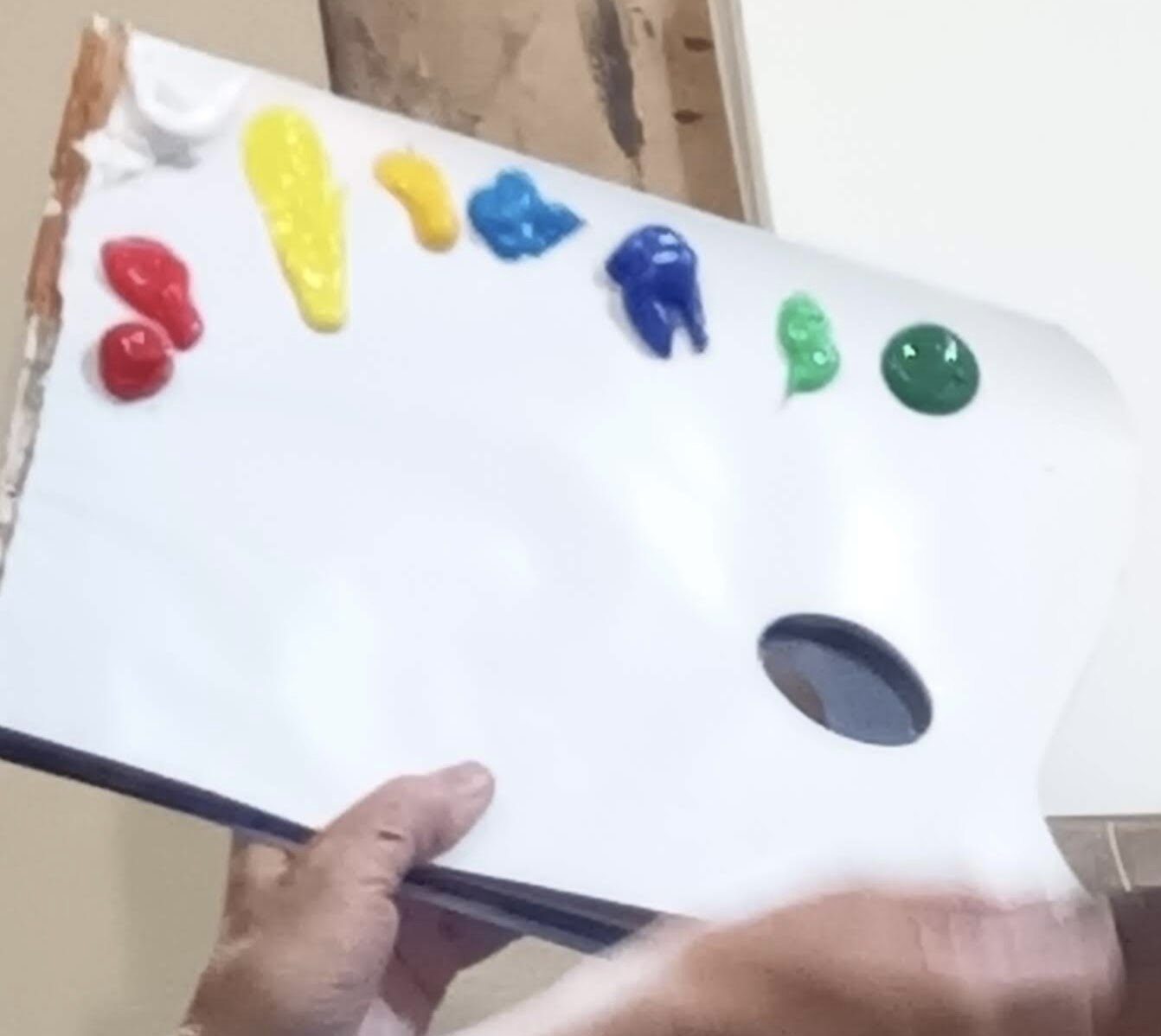
Caroline showed how she sets up her palette with warm and cool versions of green, red, yellow and blue plus white.
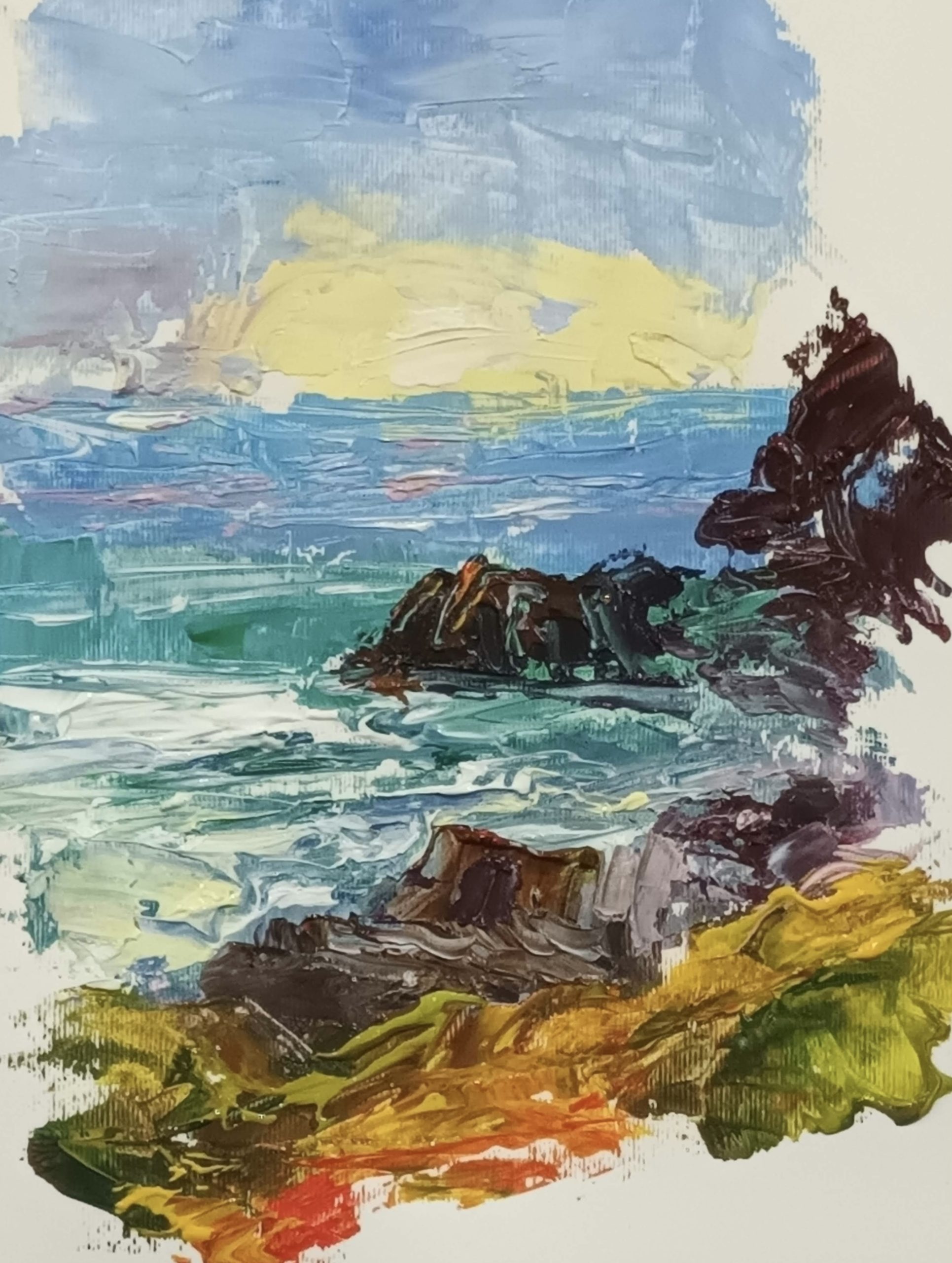
She painted a simple seascape to show how the principle of cooler and paler colours in the distance and darker, warmer colours in the foreground works to create the impression of depth and perspective. There are many examples of artists who adopt this way of working, particularly the Pre-Raphaelites.
In this demo the sky is in the coolest tones of blue and uses cool, pale yellows for the sun. Mixing cool reds and cool blues results in lilac for the sunset sky.
The sea in the distance is achieved with desaturated and cooler colours, and then coming forward uses increasingly warmer colour tones in the mixes.
The immediate foreground rocks are painted in the warmest colours by mixing subtle warm-toned browns and chromatic black. By using pops of warm colour, the focal areas have been highlighted.
Once completed, Caroline reviewed the whole picture and unified the background, midground and foreground by using touches of the same colours. Finally she adjusted the tonal values to ensure that the background recedes with palest tones and stronger colours in the foreground.