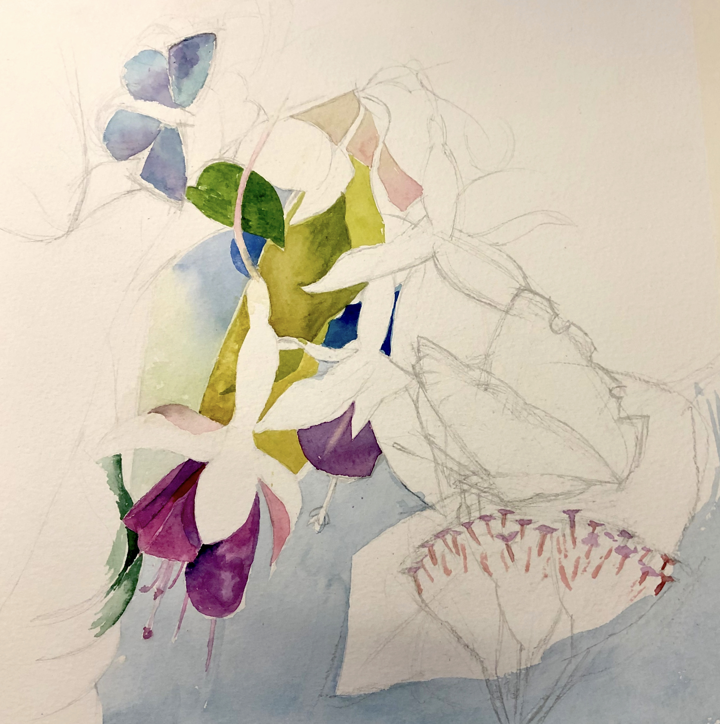
Keith started by mapping out the outlines of fuchsias in a vase using a 4H pencil. To create more interest in shapes and colour he added in two butterflies. He then carefully painted in the background by filling in the negative spaces between the flowers and leaves. Remember that the shapes created by the negative spaces are themselves a very important element in your mosaic of colour.
As he was painting a brightly coloured piece, he made sure to keep the background a subtle complementary colour. In this case, a pale blue to bring out the magenta in the flower. Old Holland permanent rose and permanent magenta were used for the fuchsia. Always use a freshly mixed paint and don’t be tempted to use some old ready mixed paint from your palette which may have become tainted. He used a green gold colour for the leaves. Using a filbert you can get a nice fine line when needed and also get enough paint on the brush to fill in the spaces; a sable brush is well worth the money.
For the more intricate little areas he used a small flat brush and if needed turned the painting upside down to let the water move around within the correct area. If you do get a small puddle forming, dry off your brush and use the brush to soak up the excess.
In watercolour the general rule is that you can apply up to three layers of colour after which the colour goes dead. If this happens you can always get yourself out of trouble by going over it with a lighter shade of pastel or pastel pencil as used in this example.
Failing this you can paint over with a thick layer of white gouache then wait for this to dry fully before going over with a quick sweep of another colour.
When painting the butterfly’s wing Keith used a graphite pencil to put in the delicate edge and then blended this into the colour.
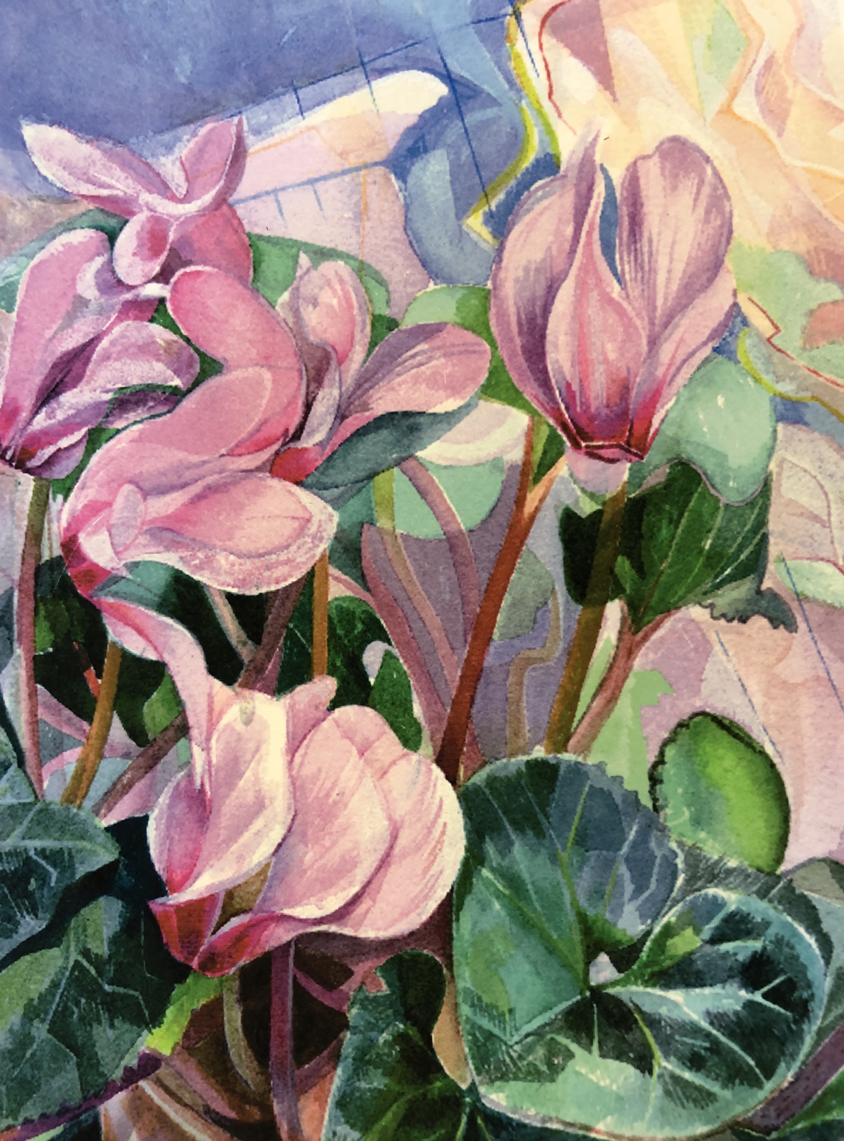
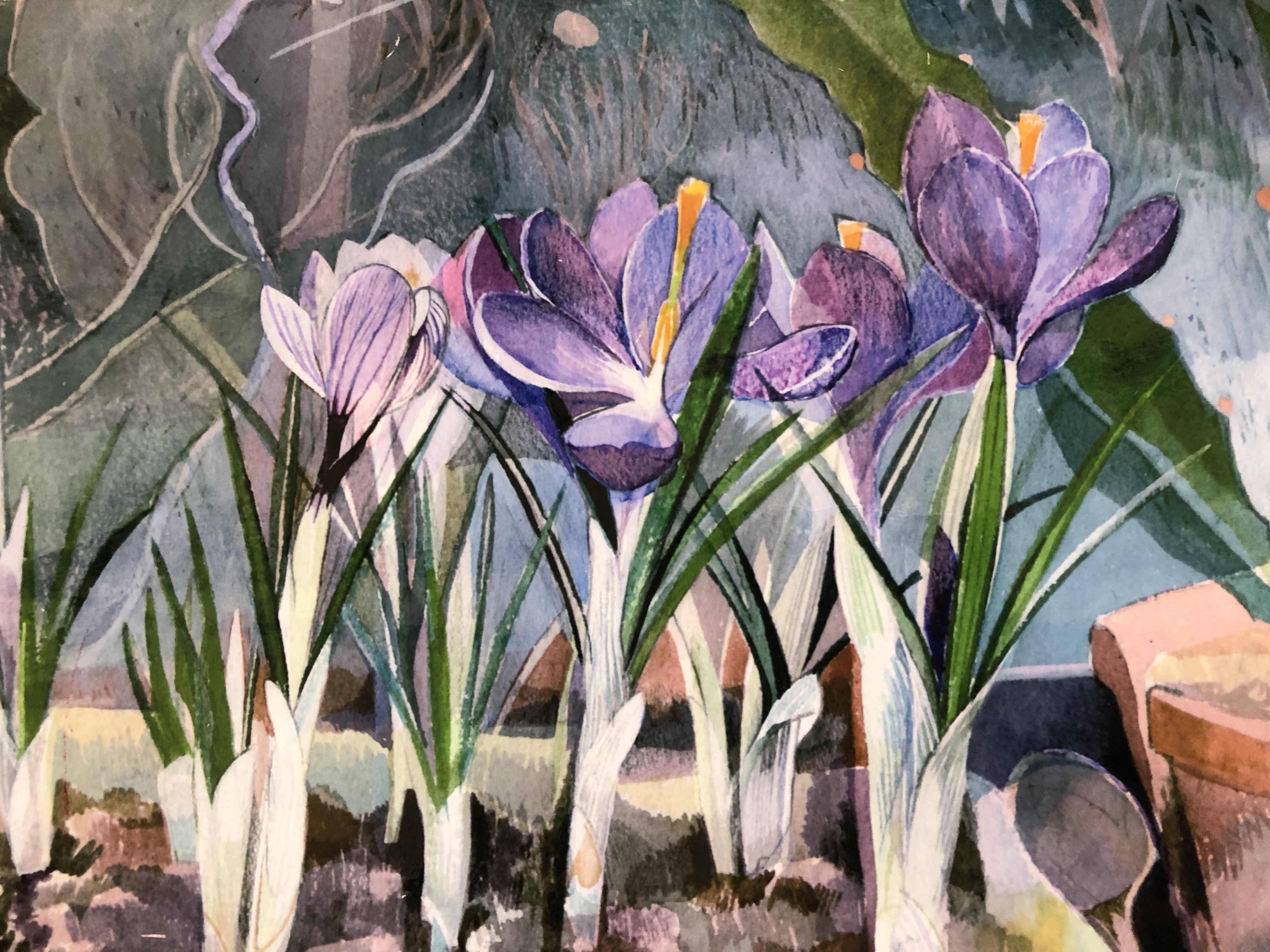
Here are another two examples of Keith’s use of negative space: