Caroline used the Pre-Raphaelites to demonstrate very good use of rest areas in paintings.
Rest areas are essential to allow the viewer to easily move their eyes around the space. Use of colour is also effective in leading the viewer around the painting. Cool colours will recede and as such will be a good choice for rest areas. You should save your more intense colours for the most important parts of the painting. You may also opt for duller colours or very similar colours for the rest areas with little contrast, keeping your lighter and brighter colours for the main focus.
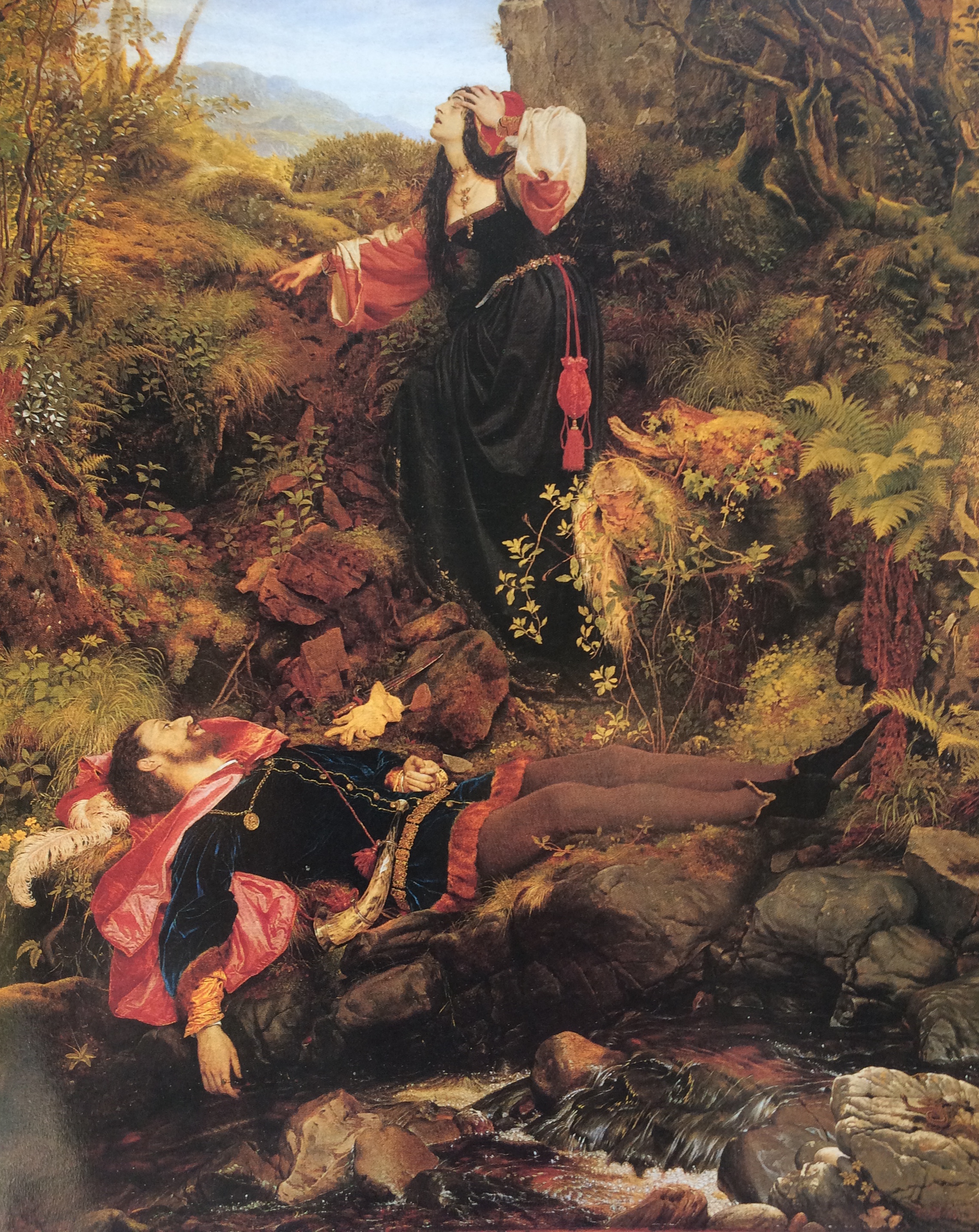
In Sir Joseph Noel Paton’s Bluidie Tryst the pale sky offers a relief, and silhouettes the main character. The right hand side of the painting is very dull so as not to distract from the main action.
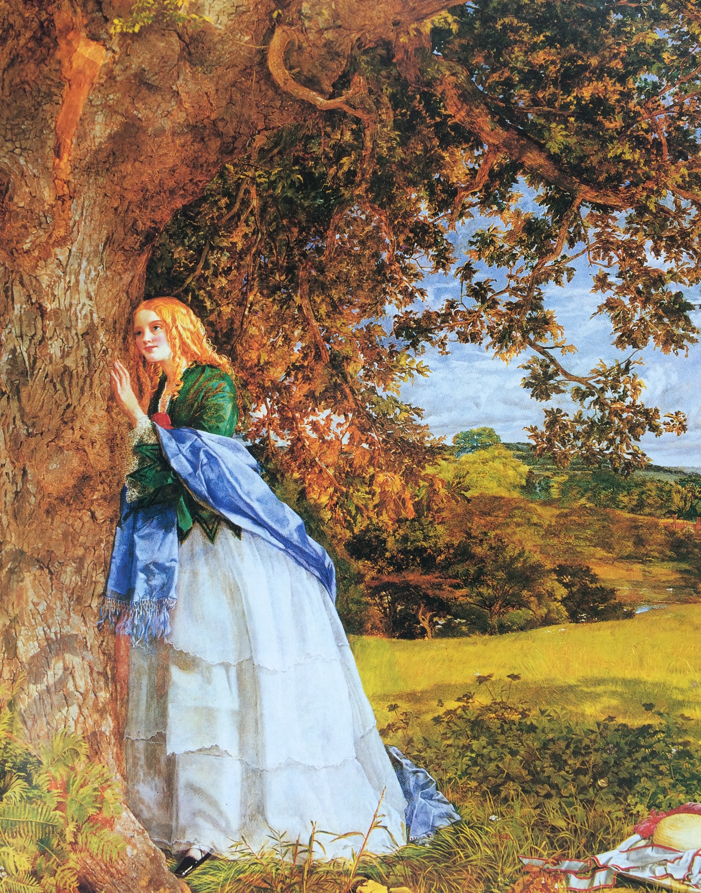
In William Maw Egley’s The Talking Oak he uses tonal restful colours for the background. Notice that the blue sky echoes the colour of the girl’s dress, which will lead the eye to it.
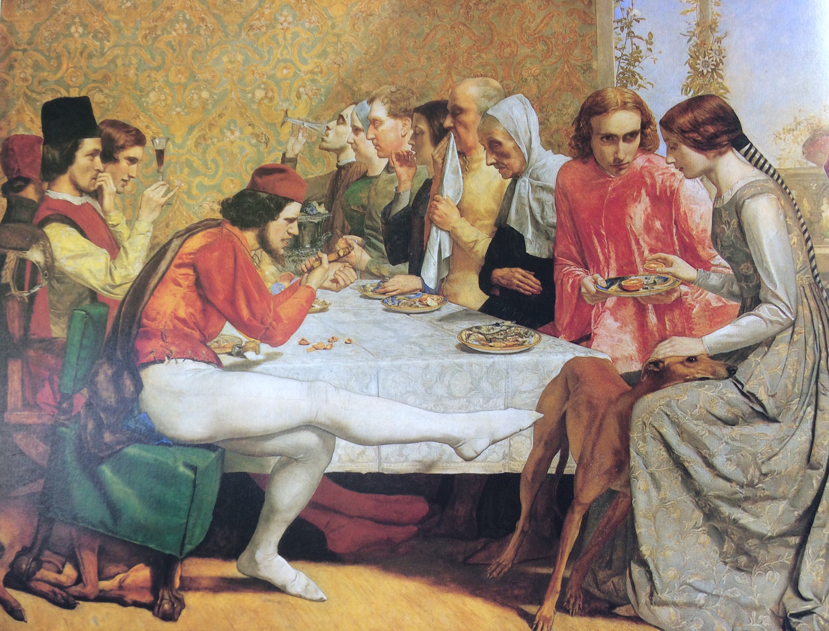
In Sir John Everett Millais’ Isabella he sets the busy scene against a fairly bland wall and a very pale blue sky.
It is a good idea to do thumbnail sketches to ensure you get the correct balance of rest areas.