When selecting a paper for pen and wash, a smooth hot pressed watercolour paper is best, as rough watercolour paper catches on the pen.
Caroline chose to work with India ink, you can also use Quink. She doesn’t recommend hobby craft ink, as it can wash off when your wash is applied, whereas the India ink is permanent.
She prefers to work with a mapping nib rather then a drawing nib, which can be a bit scratchy. The joy of using a dip pen is in the good expression you can get from the different thicknesses of strokes.
First, think about what part of your painting is going to be pen and what part wash. You may want it mainly one or the other.
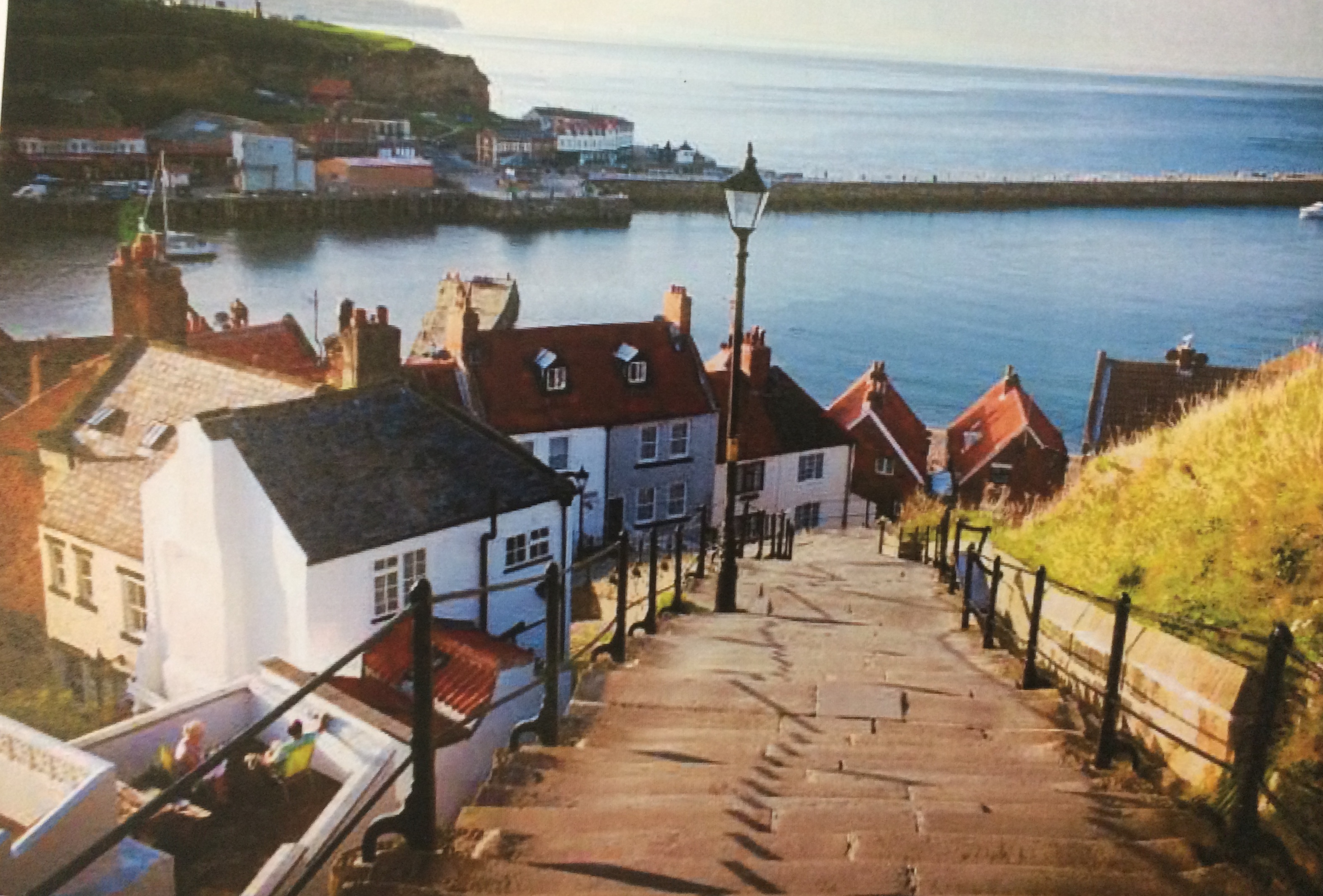
This is the photograph Caroline was working from ( it’s the steps up to Whitby Abbey)
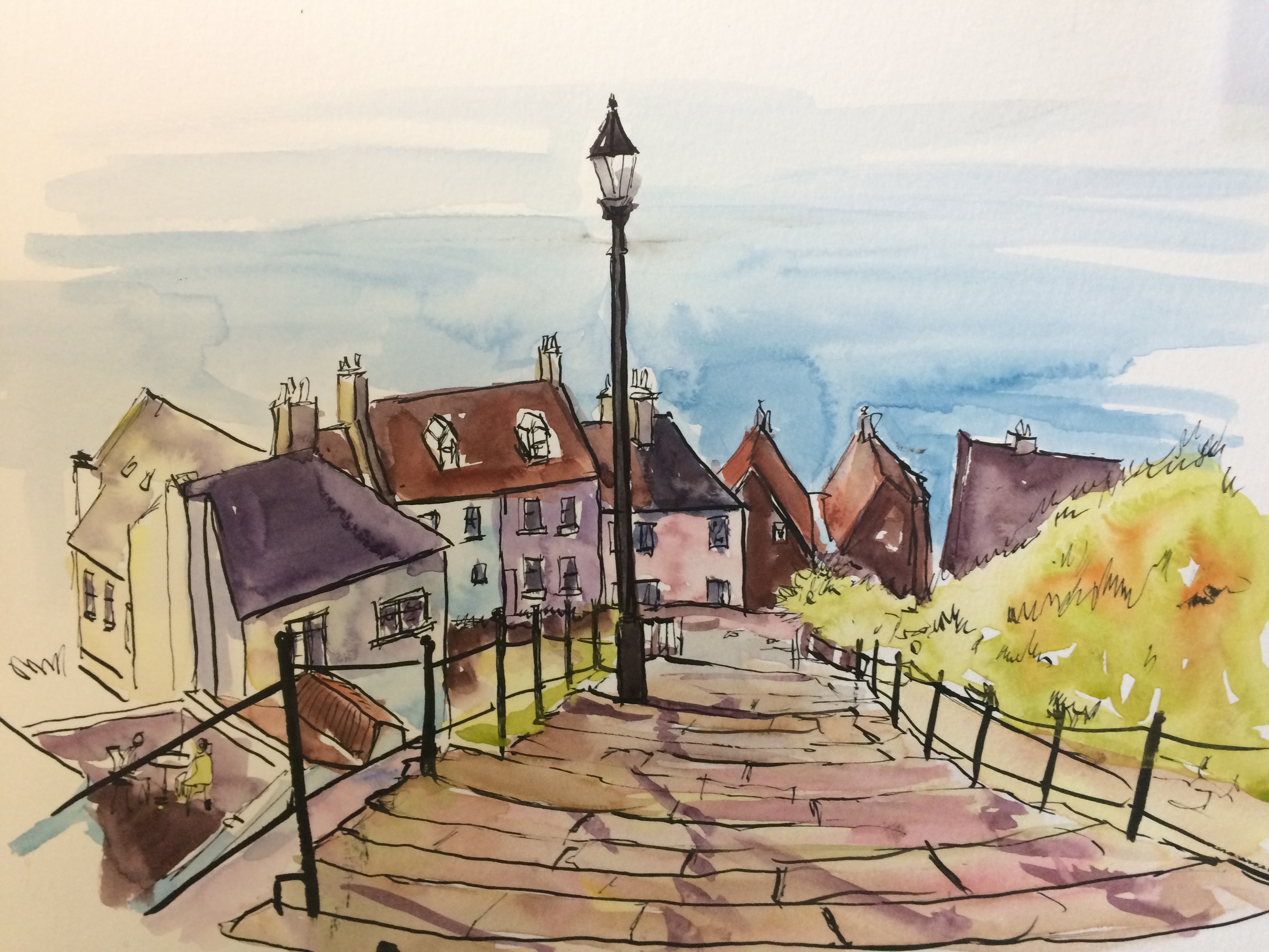
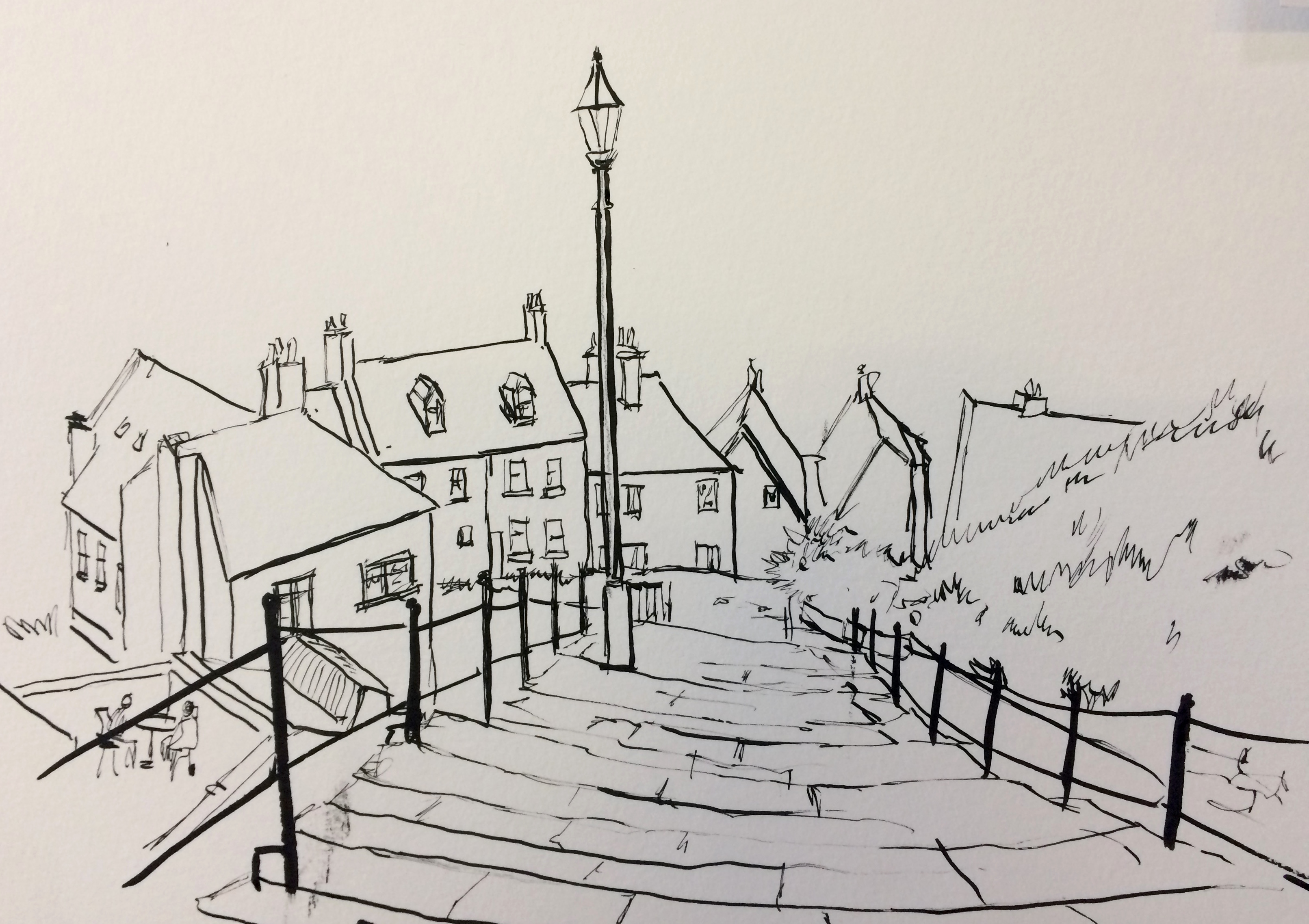
Caroline chose to start with the pen, as this gives the most freedom of expression. You should look for where the light is coming from and then make your lighter strokes on the side that is getting the light.
She started with the lamppost as this was central and then worked out from that. Remember it doesn’t have to be perfectly drawn; it is your impression of the scene. If you prefer, you can draw it out lightly in pencil first. Dip pens are good for squiggles and shapes to suggest bushes. You shouldn’t try to put in every line. A few details are all that’s needed and the viewer fills in the rest. If you have an accident and get a splurge on the page, this can be covered using white gouache.
The distant subjects should be drawn lighter with the heaviest lines saved for the foreground. Caroline used a rigger for the railings to make them stand out. Random lines are always more interesting to look at than rigid straight lines.
Check that your ink is dry before starting on the washes. Bear in mind that warm colours make a subject come forward, while cool colours will make it recede. Put in your colours paying attention to the shadows, and not being too exact with the paint, it’s ok if it bleeds a little. You don’t want it to look like painting by numbers!
Caroline used ultra marine and sienna to get the lovely dark shade for the windows. The more distant the lighter your paint should be , so the stairs are paler at the most distant part which helps with the perspective.