All colours are made up of combinations of different pigments. The resulting colour can be either cold or warm depending upon the exact proportions of each pigment used. When selecting your palette you should choose one of both cold and warm for each colour . For example a cool version of red would be Cadmium red deep or Alizerin crimson, whereas a warm version would be Cadmium medium or Flame red. If you were wanting to make a purple you would choose a cool red plus blue, but if you were making an orange you would opt for the warm red plus a warm yellow. To make a lively green use a cool yellow and blue because if you use a warm yellow you will get an olive green .
Use of a colour wheel can let you see which colours compliment each other .
Caroline painted a series of red squares all identical then changed the background to show how different chroma change how the red square is perceived.
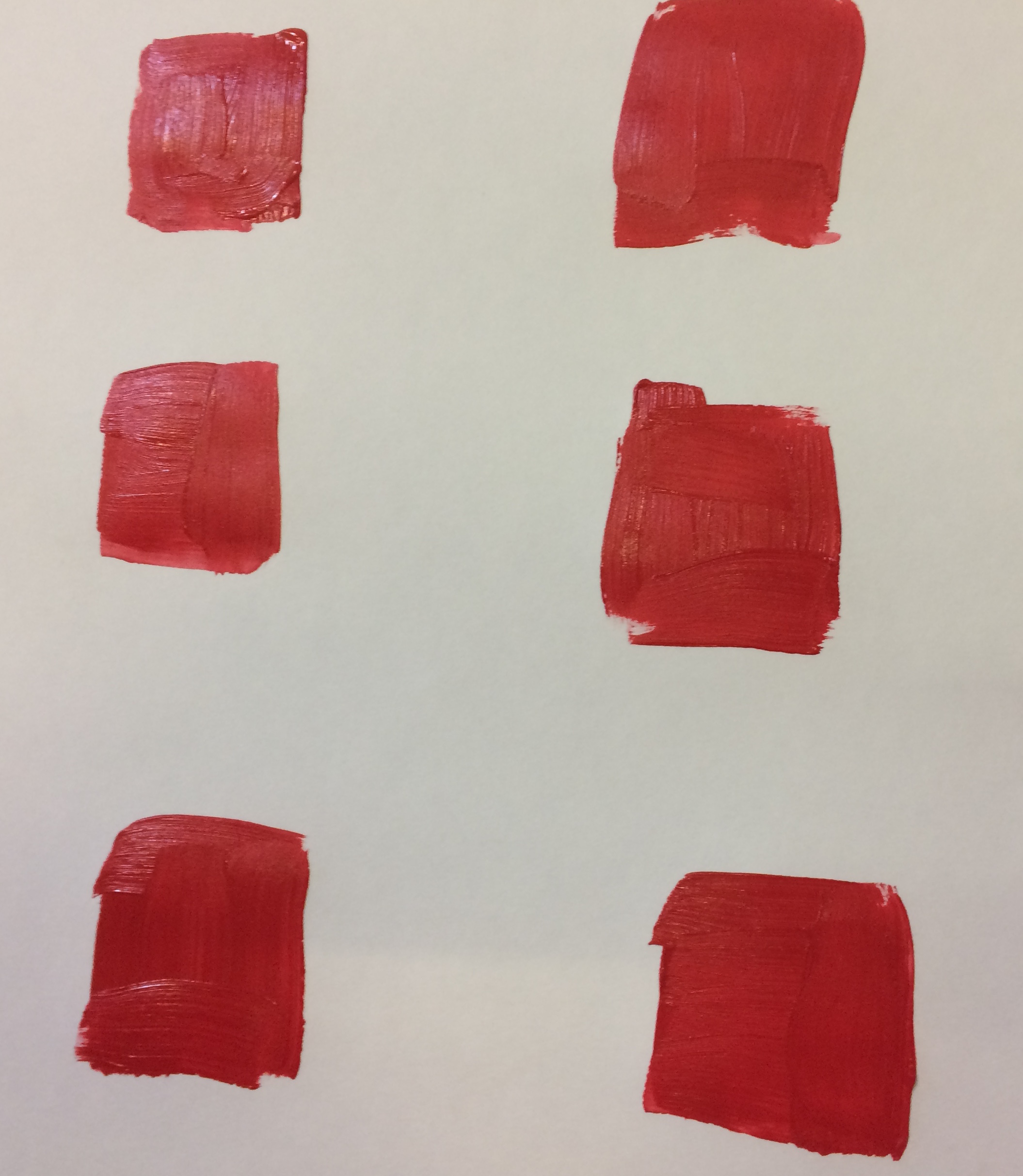
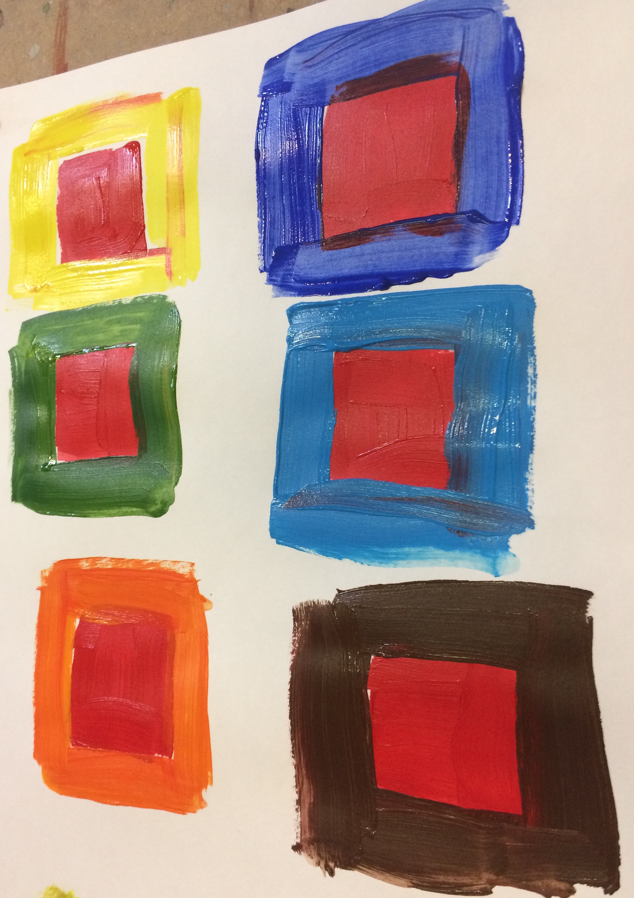
You can see that some of the squares now appear more intense than others. Using the cool blue and the cool yellow makes the red recede , but using the higher chroma colours of the warm yellow and the orange make it really jump out.
Here we can see the effect using greens of different chroma.
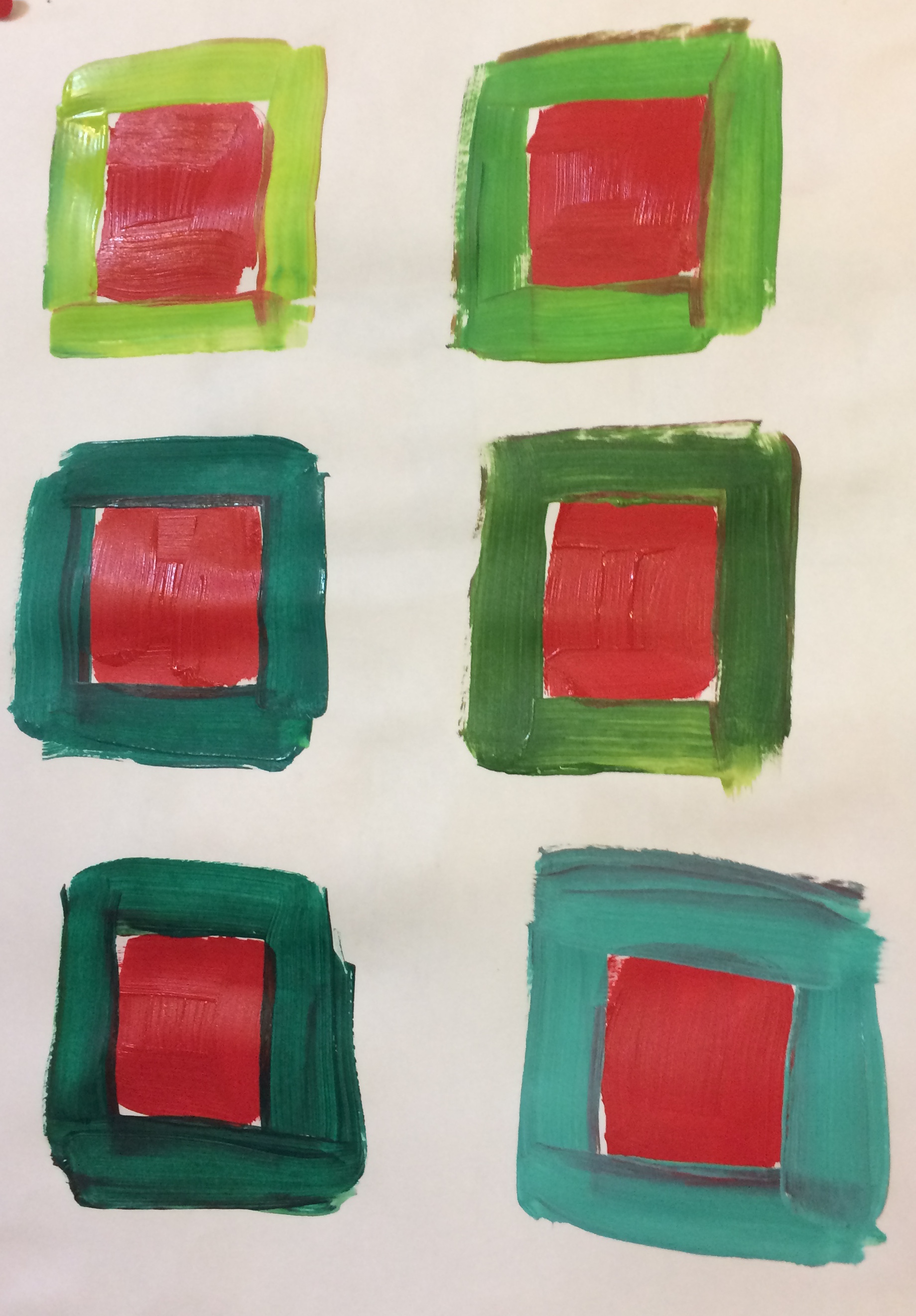
In this case the more intense the green the more the red stands out.
In portraits using a background colour of a less intense chroma than the one you will use for the eye colour is often an effective way of making the eyes stand out.
Rothko was very skilled in his use of chroma for effect. Many artists use the technique to bring their work alive. Using a high chroma in the foreground against a background of more muted colours always works well.
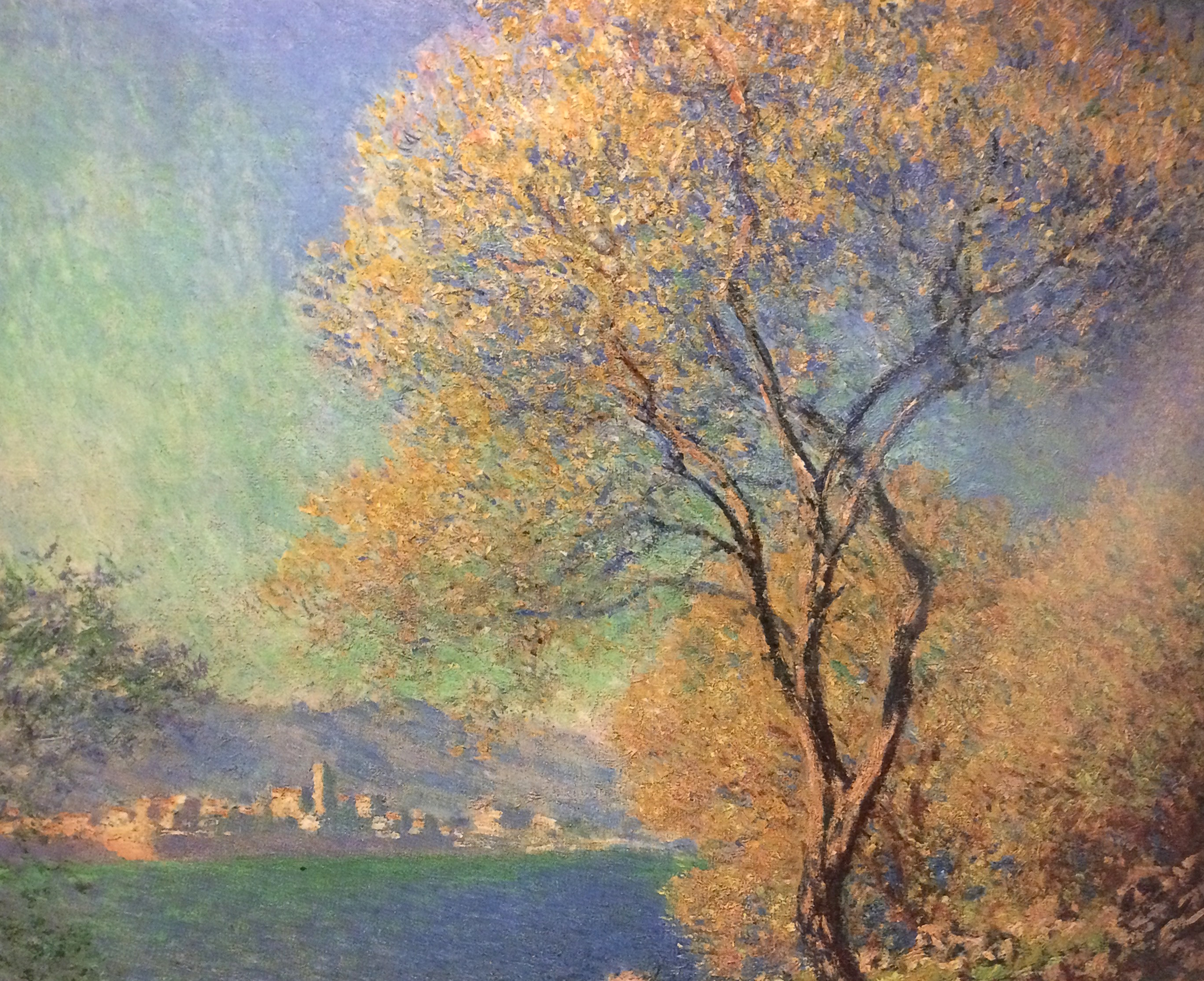
In the painting below, the tree and the buildings in the background really stand out, as a high chroma was used.