My thanks to Lesley McBride for again supplying notes and images for this talk.
Caroline began by discussing the ways in which book covers are designed nowadays. Everyone uses a computer, employing either GIMP or Photoshop, which are both compatible with Mac and PCs , but GIMP is free.
The work is done in layers:
The first layer may be the author’s name
The second layer the title of the book
The third layer the image you have chosen
Caroline gave a quick demonstration using one of her still life images, and showed us how to manipulate the image to fit, and also how to change the background colour, font styles and colours to obtain the most effective result.
You would go about choosing your image based upon what the book was about, e.g. historical, modern, spy, murder mystery, sci-fi, romance etc…
Remember the design needs to stand out on the bookshelf. To this end it is useful to employ red either in the image or the lettering as the eye is always drawn to red. Similarly a nude is likely to draw attention.
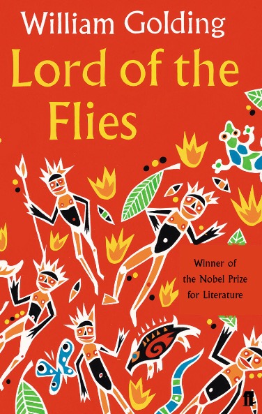
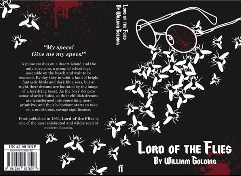
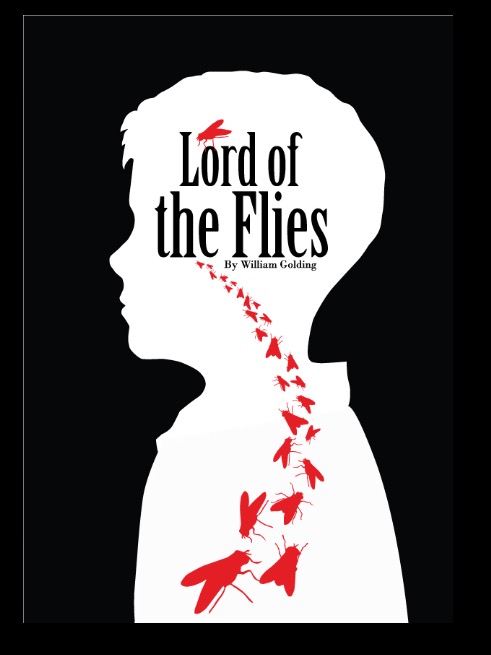
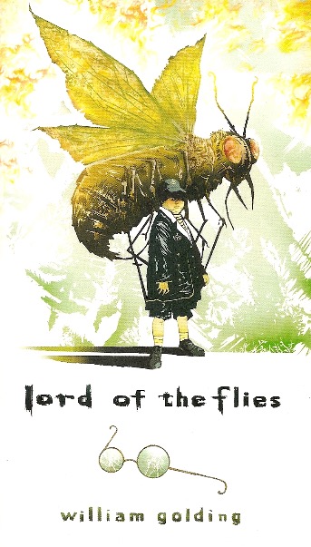
She discussed several book jackets that were used for Lord of the Flies, some of them being much more effective than others. We all agreed that the one showing the silhouette of the young boy in white and the flies in red invading his brain was the most compelling. You may prefer another one, as it is a subjective thing. I have included copies of some of the jackets for your perusal.
It should be borne in mind that the image should not make the lettering hard to decipher, they should complement each other, and the lettering should not be so stylized that it is confusing.